GLOBAL NAVIGATION REDESIGN
A full overhaul of Patagonia.com's global navigation and category taxonomy, making it easier for customers to find what they're looking for, faster, while keeping Patagonia's mission visible throughout the journey.
THE BRIEF
Define the biggest possible vision for Patagonia's product discovery experience
The brief from leadership was to imagine what Patagonia's path to purchase could be at its best. The vision was an experience akin to shopping with a trusted outdoor gear expert: intuitive discovery that connects customers to the right products for their preferences and goals, immersive storytelling that highlights quality, responsibility, and real-world use, and personalized recommendations based on sport, environment, and budget.
Customers would shop confidently with guidance, authentic storytelling, and seamless navigation — making informed decisions while feeling connected to Patagonia's mission. This was the north star. Our job was to figure out where to start.
DATA SOURCES
To pressure-test the vision against reality, we anchored the discovery work in three primary sources: Fullstory behavioral data, a Brand Health Report, and a SWOT analysis gathered by the product manager.
Fullstory Data:
- Session replays and heatmaps revealed where customers struggled to navigate the catalog
- Funnel data showed significant drop-off points between homepage and category pages
- Mobile sessions highlighted how the current nav failed users on smaller screens
- Search usage patterns indicated customers were defaulting to search when the nav let them down
Brand Health Report
- Surfaced how customers perceive and emotionally connect with the brand versus how they shop it
- Revealed gaps between brand affinity and product discoverability — strong loyalty, weak catalog exploration
SWOT Analysis
- Strengths: deep brand loyalty, unique product storytelling, strong sustainability positioning
- Weaknesses: fragmented taxonomy, outdated navigation structure, poor mobile conversion
- Opportunities: activity-based discovery, circularity integration, new catalog expansion (Provisions, Shop Used)
- Threats: competitors with more intuitive browsing; 42% of customers don't consider Patagonia for exercise/training
FRICTION POINT AFFINITY MAPPING
Quantifying where customer pain is most intense
We organized customer friction points into natural groupings, quantifying where pain was most intense across six clusters: Understanding Gaps, Filtering & Sorting, Homepage & Discovery Barriers, Versatility/Longevity Confidence Fatigue, Personalization, and Guided Shopping. Cross-referencing these with funnel data gave us a prioritized view of where to focus.
Highest Impact Friction Areas
- Navigation Structure — 42% don't consider Patagonia for exercise/training; over-categorization forces siloed paths
- Filtering & Sorting — only “Waterproof” appears in top 20 filters at 1% usage; missing multi-select functionality
- Homepage Discovery — no products above fold; 33% drop off immediately after homepage
- Mobile — 65% of traffic is mobile but conversion lags significantly behind desktop
Open Questions Identified
- Where does filtering make more sense than navigation depth?
- How much category depth actually supports vs. overwhelms product discovery?
- What internal constraints (backend systems, merchandising, brand) need to be considered if structural changes are made?
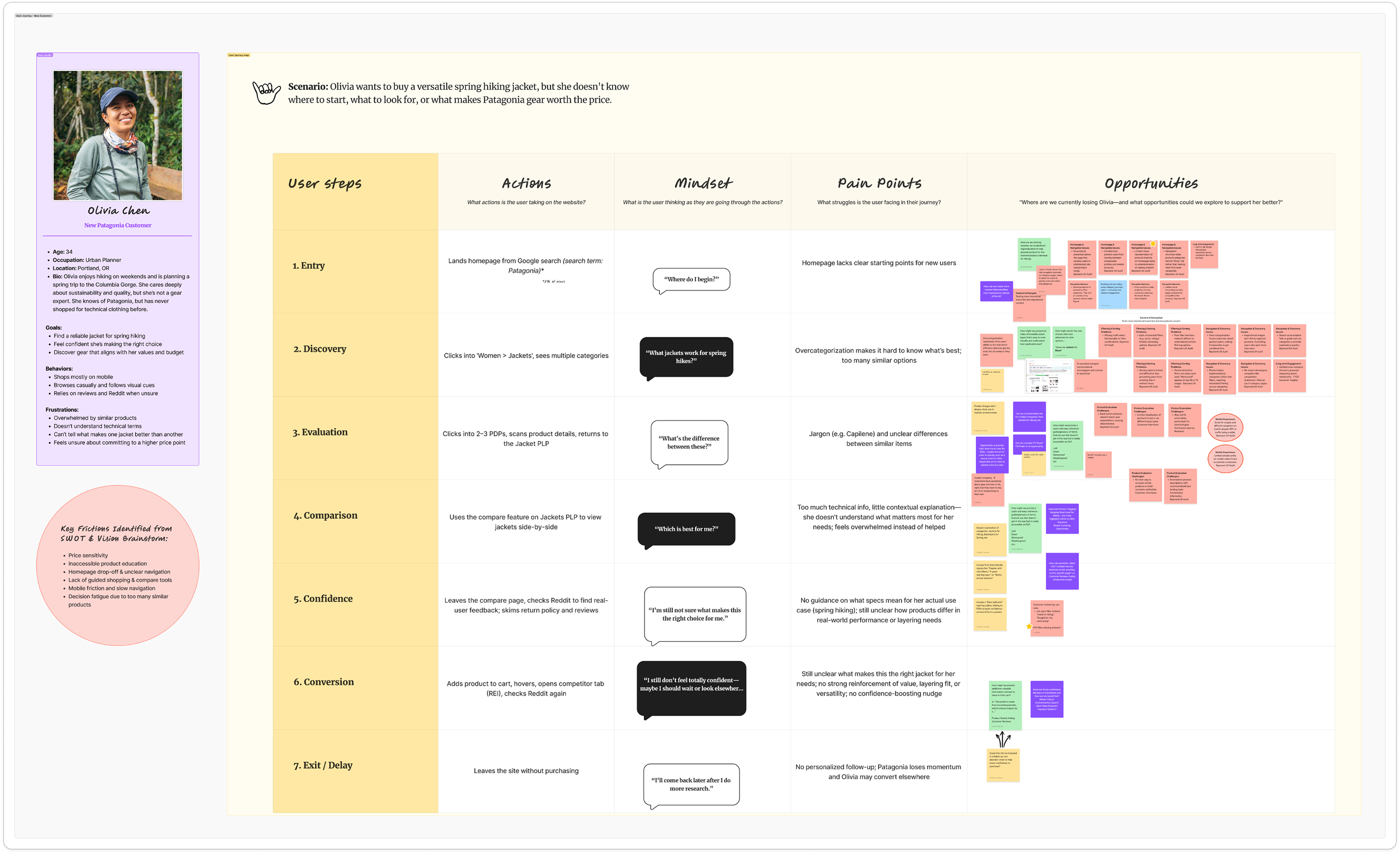
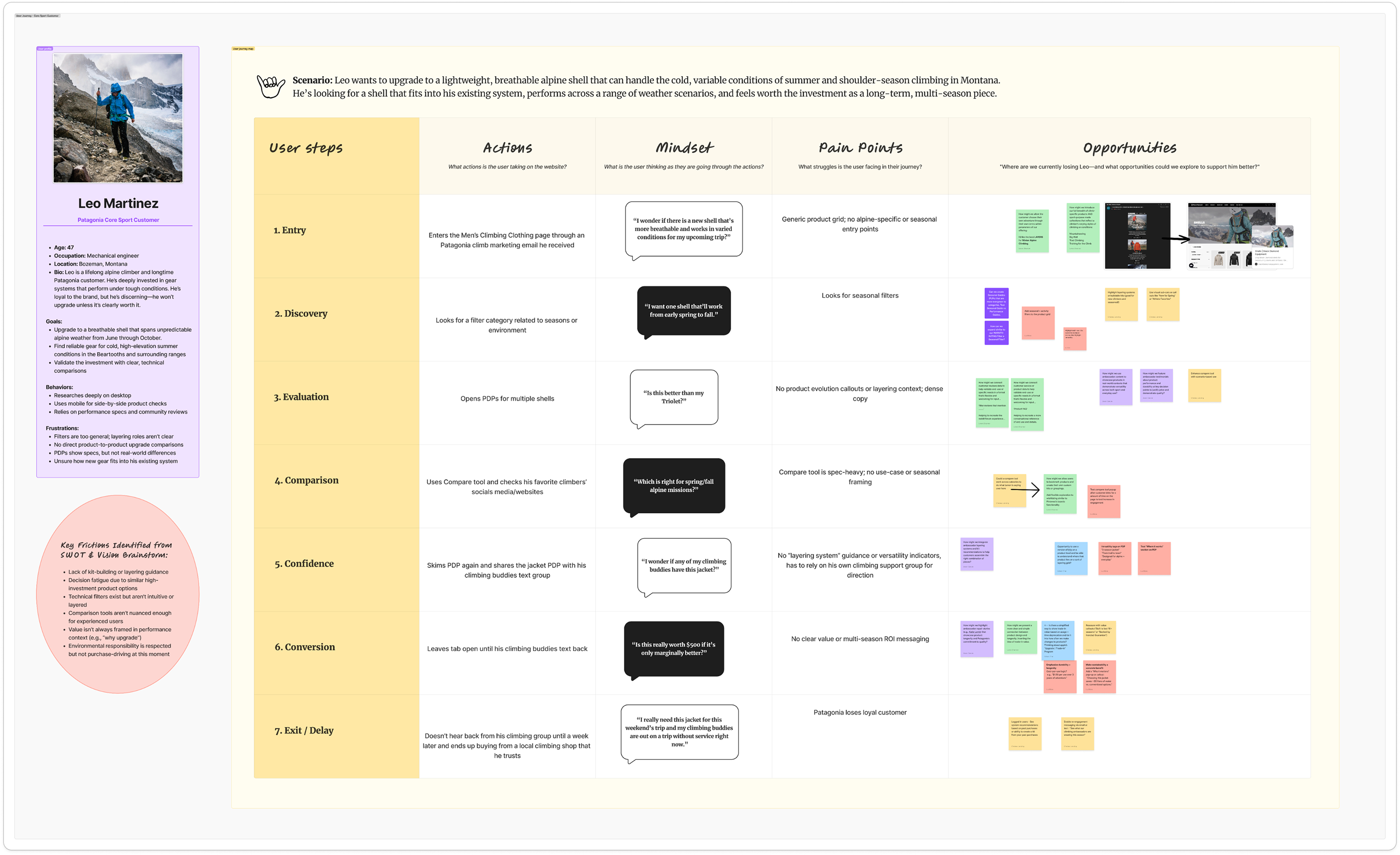
PERSONAS & JOURNEY MAPPING
Two distinct customer personas to guide the work
After we identified the friction points, we grounded the work in real user behavior across two core personas and created journey maps for each to connect leadership to actual user challenges and surface opportunities that would anchor future solutions.
Two distinct customer personas anchored our journey mapping:
- Olivia, a new customer planning a spring hiking trip who struggles to know where to start
- Leo, a core sport customer who shops with precision and expertise but hits friction around cross-category discovery
DISCOVERY WRAP UP
Focus on Navigation
With journey mapping complete and friction points organized through affinity mapping, we needed to move from problem framing to solution shaping. The opportunity solution tree exercise was the bridge — taking the opportunities we'd identified across both personas and stress-testing them against each other to understand which would have the greatest impact on the user's product discovery experience.
Each opportunity was mapped against the friction points it addressed. What emerged wasn't a list of features — it was a clear hierarchy of impact. The exercise made one thing difficult to argue with: a navigation redesign would do more for product discovery than any other single intervention. It was the most direct path to reducing the friction that was causing customers to abandon, default to search, or never explore the catalog at all.
- Navigation friction was the highest-impact, most directly addressable problem in the funnel
- 42% of customers don't consider Patagonia for exercise or training — a reach problem rooted in discoverability
- 33% of users drop off immediately after the homepage — a flow problem the navigation could directly address
- A fixed taxonomy foundation would reduce complexity for future work
This finding gave the team — and leadership — a concrete, evidence-backed rationale for where to focus.
View Discovery Exercises in FigJam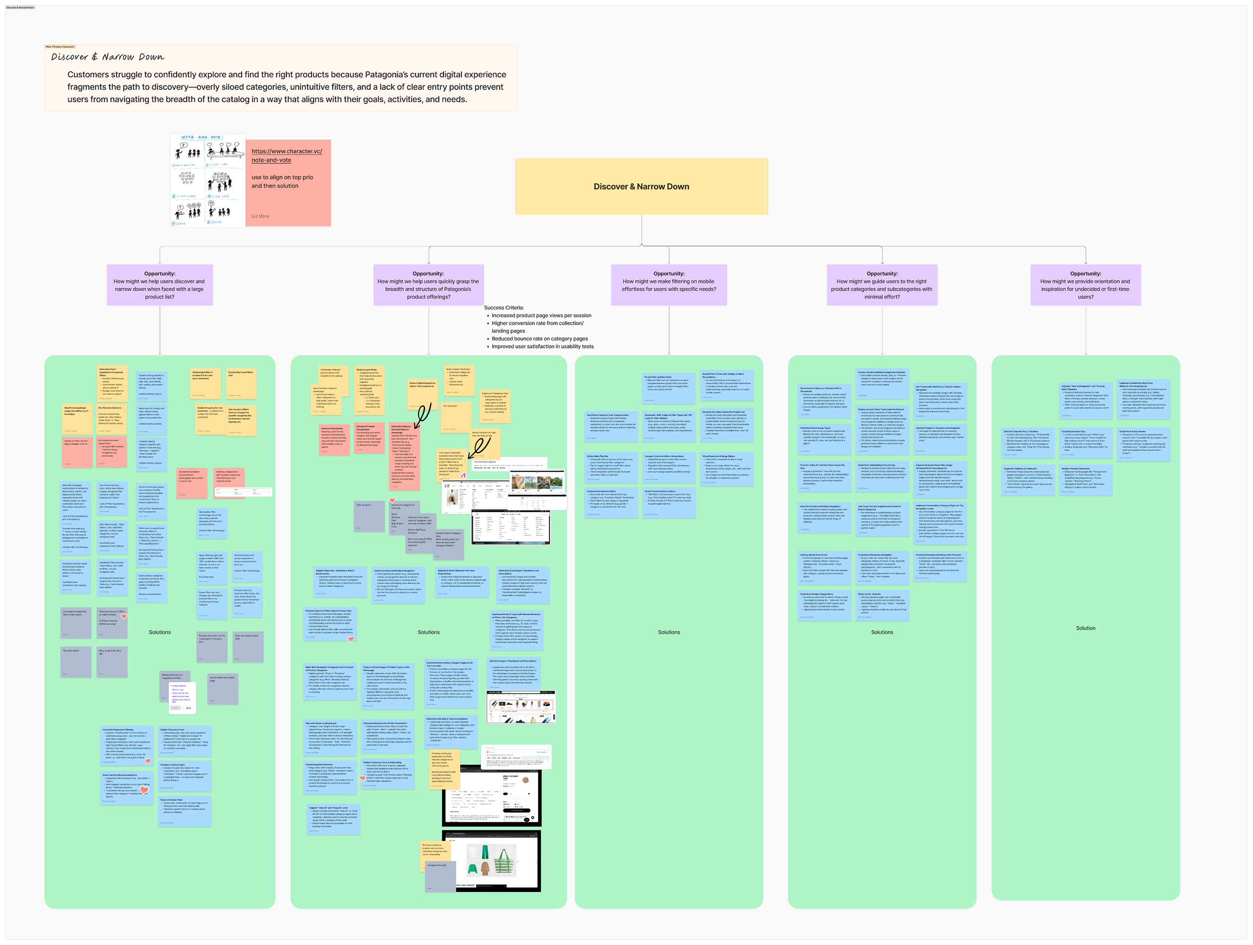
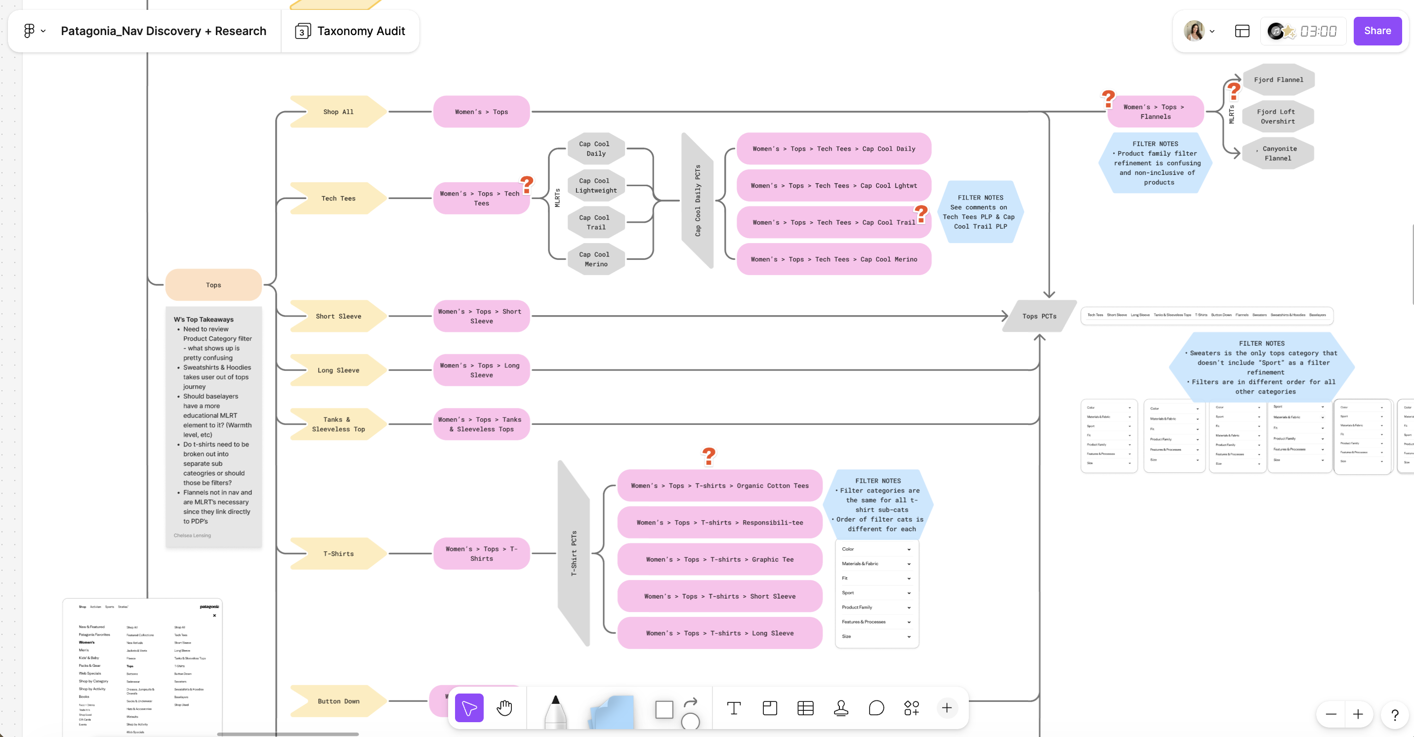
TAXONOMY & NAVIGATION AUDIT
Understanding how customers navigate and where they get lost
We combined a Taxonomy & Navigation Audit, a Baymard UX audit, funnel analysis, user journey mapping, and a friction point affinity mapping exercise to build a comprehensive picture of the problem. The taxonomy audit was conducted in June 2025 with three goals:
- Identify friction points in the current structure
- Build cross-functional alignment between UX, merch, brand, and product teams
- Lay a foundation for system-level decisions about how we define categories, filters, and activities across the site.
PROBLEM STATEMENT
Patagonia's current navigation reflects internal catalog logic rather than how customers actually think about shopping. Overly siloed categories, inconsistent taxonomy, and a lack of flexible entry points prevent customers from confidently exploring the catalog — causing them to abandon, default to search, or never discover the full breadth of what Patagonia offers.
DESIGN HYPOTHESIS
If we restructure the global navigation around customer mental models — offering flexible entry points by gender, activity, and product type — customers will be able to find the right products faster and with less friction, resulting in higher navigation engagement, increased category exploration, and improved conversion.
DESIGN PROCESS
Early Structural Exploration
With the structural direction roughed out through napkin sketching and early cross-functional working sessions, the next step was to translate the two most promising concepts into something testable. The audit findings, Baymard best practices, and internal alignment with engineering and merchandising had surfaced a core tension that sketches alone couldn't resolve: should customers enter the catalog through gender — the familiar, convention-aligned pattern — or through sport and activity, which more closely reflected how Patagonia customers actually think about what they buy?
Rather than resolve that tension through internal debate, I brought both directions forward as fully realized concepts.
DESIGN PROCESS
Moving from Lo-Fi to Hi-Fi
Starting from the napkin sketches, I developed two distinct lo-fi wireframe directions — one gender-focused, one sport-focused — exploring how each would handle the same core navigation challenges: L1 structure, sub-category depth, activity entry points, and the placement of brand content. The lo-fi phase was about stress-testing the logic of each structure before investing in visual execution.
From there, I brought both directions to hi-fi wires and built interactive prototypes for each — giving usability test participants a realistic experience to react to rather than an abstract concept to evaluate.
DESIGN PROCESS
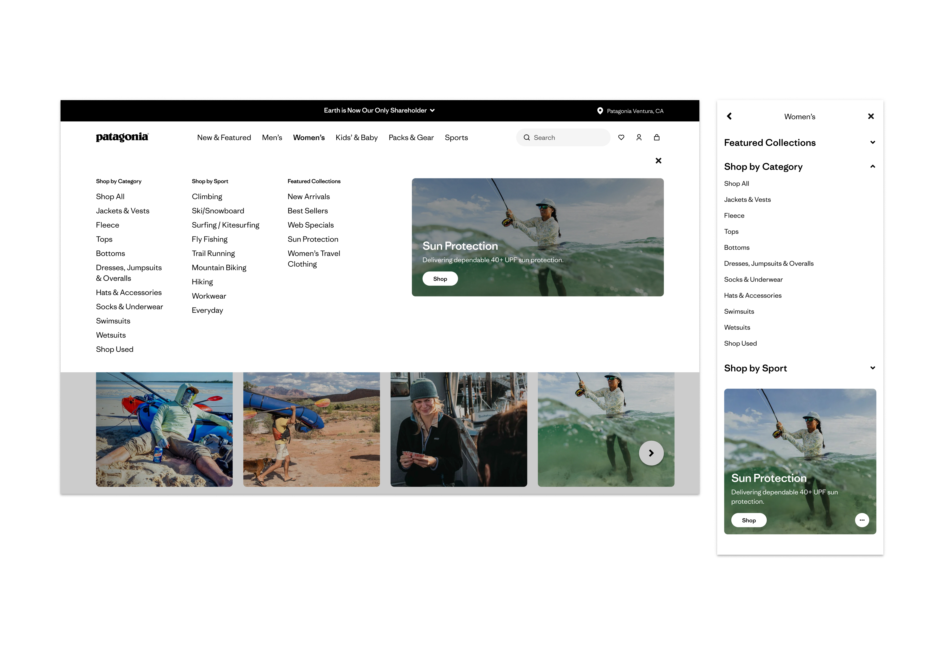
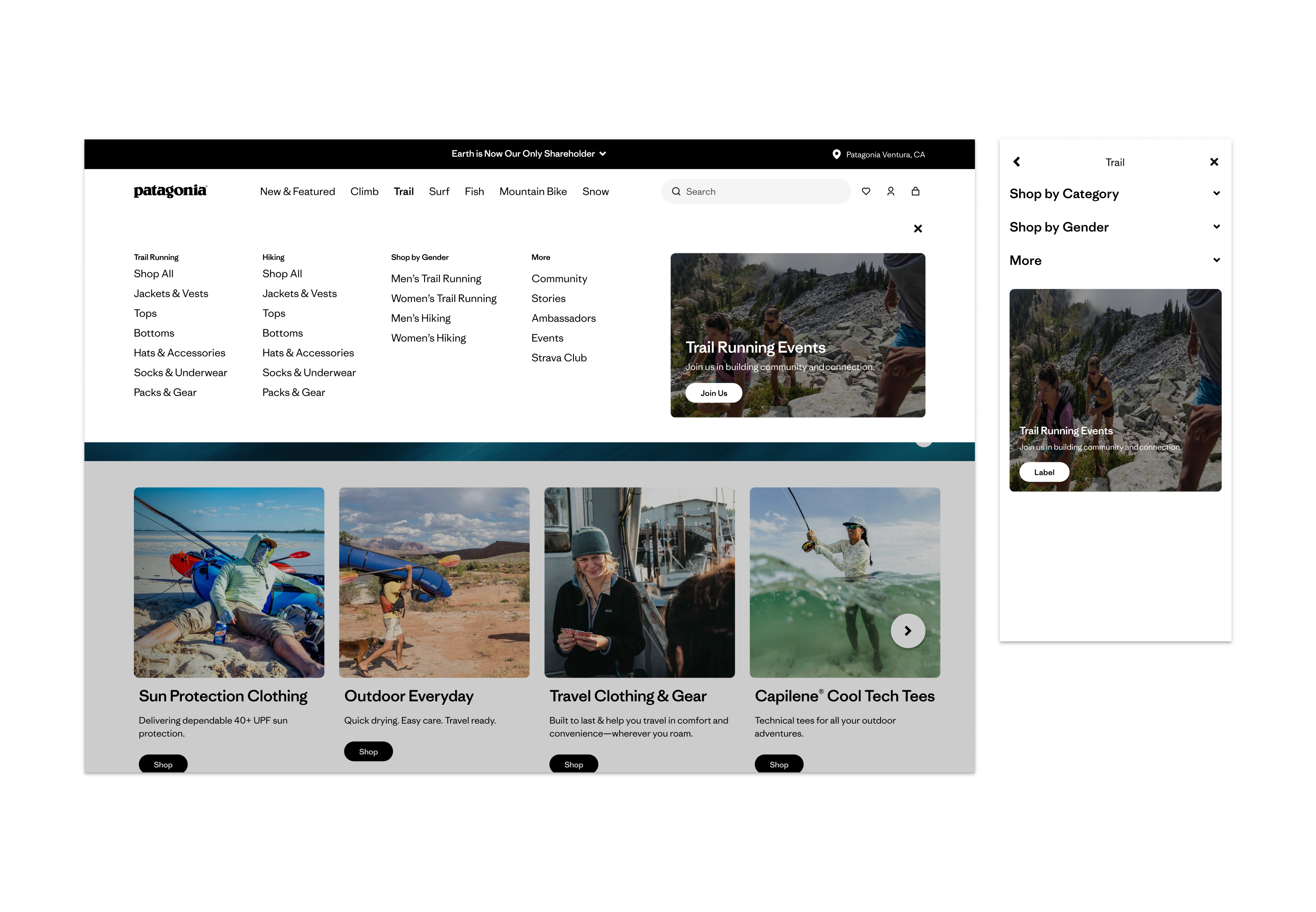
Gender Focused vs Sport Focused Navigation
The two directions were brought to hi-fi and prototyped for user testing. Below are the final concepts taken into the study.
USER TESTING — SURVEY
What did we validate — and what changed?
Before running full usability testing, I designed a survey to collect quantitative signal on how customers prefer to shop — and which navigation structure would help them find things faster. 42 participants completed the survey.
The data surfaced a revealing tension: 62% said they shop based on a specific activity or sport, yet when presented with the two navigation concepts directly, 60% said the gender-focused menu would help them find things faster. Customers default to familiar patterns even when their actual behavior is activity-driven. This told us that supporting both entry points wasn't a compromise — it was the right call.
Key findings:
- 40% prefer to start by product type, 29% by gender, 19% by sport or activity
- 60% chose the gender-focused menu as faster for finding products
- 62% identify as activity or sport-driven shoppers
- 92% shop for themselves
USABILITY TESTING
What did we validate — and what changed?
With survey data in hand, I ran a multi-method usability study to validate the redesigned navigation against real customer behavior before development handoff.
What we tested: a prototype of the redesigned navigation menu for Patagonia.com. Goal: understand how users explore, shop, and interpret the navigation experience.
Study composition:
- 8 unmoderated tests via Usertesting.com (5 new customers, 3 current — Desktop)
- 6 moderated in-person sessions at the Ventura retail store (all current customers — Desktop)
- 3 unmoderated mobile tests post-desktop testing (1 new, 2 current customers)
Focus areas: task completion across categories, collections, sports, and brand content; discovery of new products and brand content; label clarity and feature expectations.
“I usually shop by activity. That's faster and more relevant to me.”
-PARTICIPANT, USABILITY TEST VIA USER TESTING
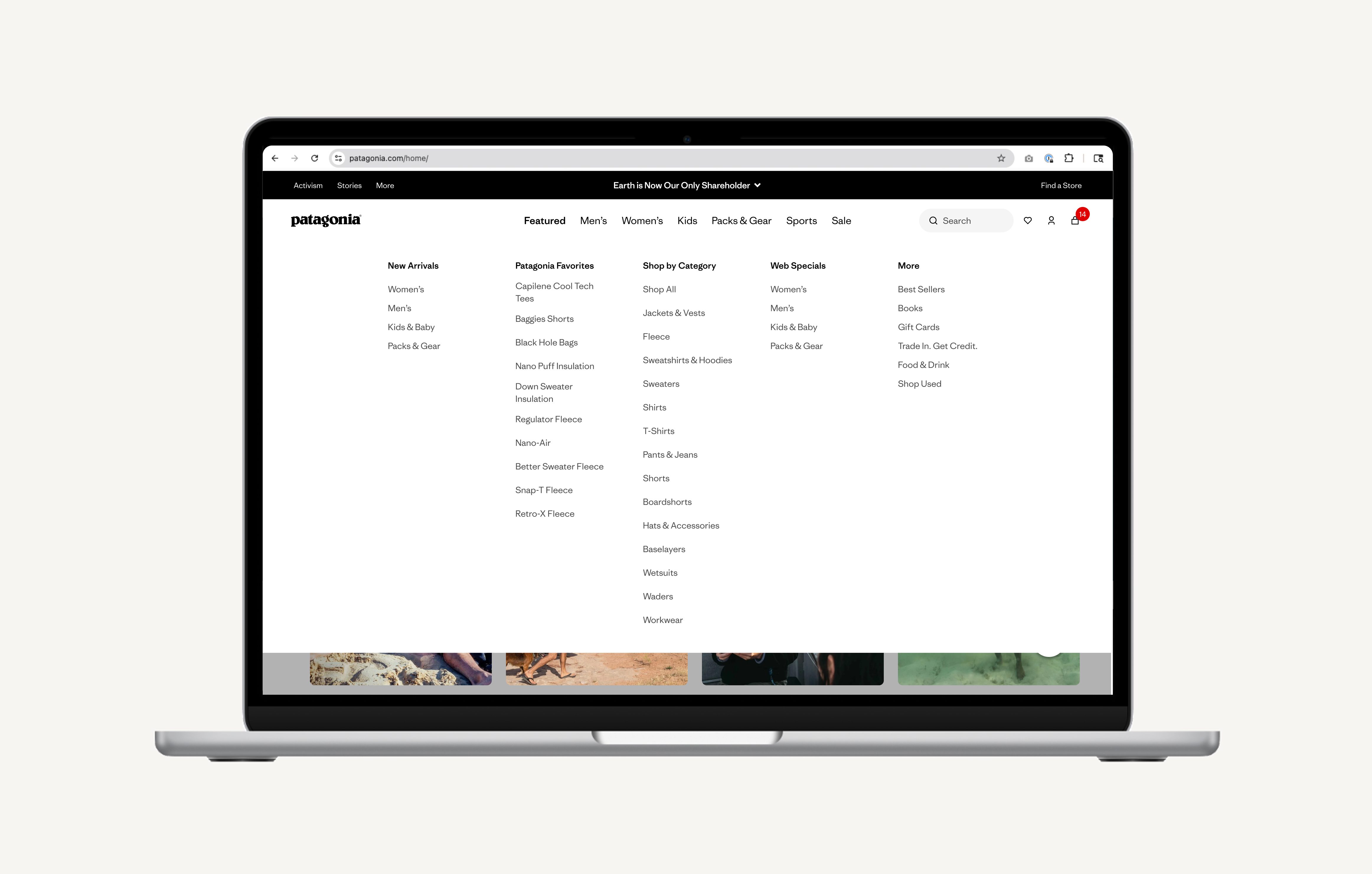
FINAL DIRECTION
The solution we moved forward with
The survey and usability testing data pointed clearly to a hybrid architecture — a gender-first navigation structure that also supports sport and activity as a parallel entry point. This wasn't a split-the-difference decision. The data showed that customers have genuinely different mental models, and the right system needed to meet all of them.
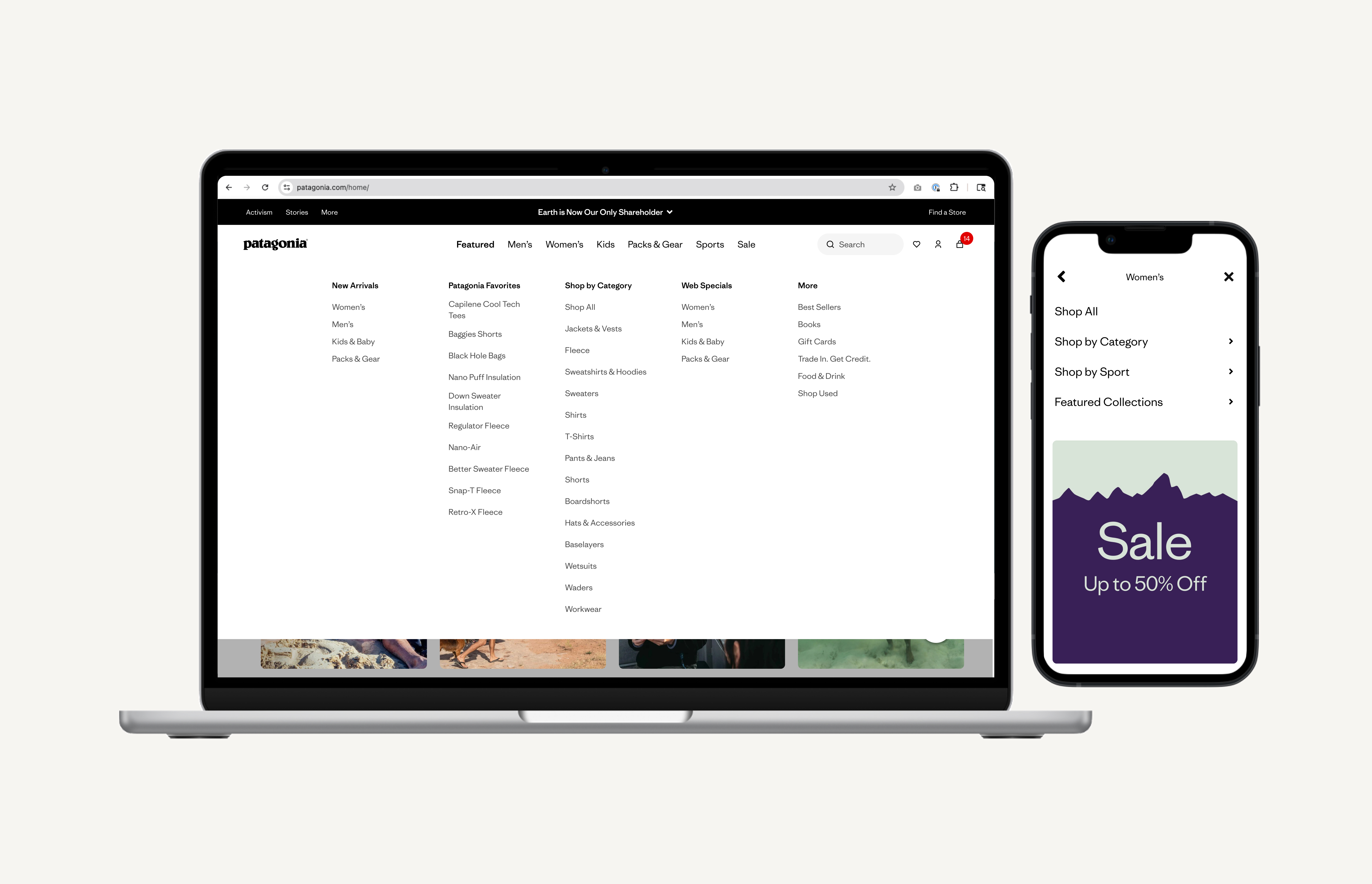
The final navigation leads with Men's, Women's, and Kids as primary L1 anchors — the familiar, fast path for customers who know what they want. Sports are elevated as a parallel top-level entry point for customers browsing by what they do. Brand content — Activism, Stories, Guides — moves out of the shopping path entirely and into contextual placements where it earns attention without creating friction.
HANDOFF & SPECS
Cross-functional coordination to ship a global navigation change
Shipping a global nav change required tight coordination across Engineering, Merchandising, Brand Creative, and international teams in EU and JP. I produced Figma specifications for every component state and worked directly with engineering through a phased build review process.
Figma Spec DocumentationDeliverables Produced:
- Figma component library with all nav states
- Annotated interaction behavior
- International variant specs for EU and JP
Cross-Functional Work:
- Design QA period — caught critical rendering issues before moving to UAT
- Weekly syncs with Merchandising to validate taxonomy mapping against backend catalog structure
- Post-launch monitoring: weekly check-ins for four weeks to surface and resolve production edge cases
+27.5%
Navigation engagement rate vs. baseline
2X
Conversion rate vs. users not engaging with the nav (3.75% vs. 1.6%)
$6.6M
Revenue generated through the redesigned experience
BUSINESS IMPACT — 3 MONTHS POST LAUNCH
Customers are discovering more of Patagonia, faster
Three months post-launch, users interacting with the new navigation converted at more than double the rate of users who weren't (3.75% vs. 1.6%). This isn't a launch spike, it's sustained performance that reflects a fundamentally more intuitive experience. PLP click-through rate increased 12.9%, and users were reaching a product detail page in under 45 seconds on average.