DESIGNING WITH AI
From napkin sketch to deployed portfolio site — a design-to-code workflow using Figma, Claude Code, and MCP.
THE PROJECT
A new kind of design-to-code workflow
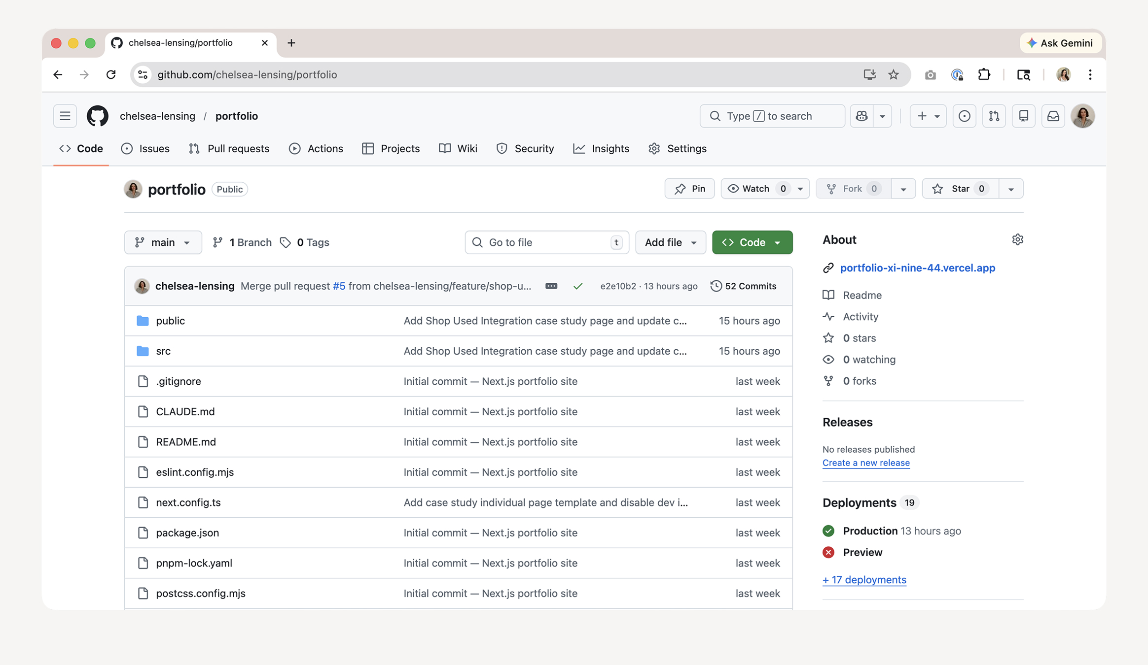
This project documents the end-to-end process of building my personal portfolio website — not just as a design exercise, but as an exploration of what AI-assisted design workflows can look like in practice. Rather than handing off specs to a developer, I used Claude Code as a collaborative build partner, bridging the gap between Figma and production code through a Figma MCP integration.
The result is a fully designed, fully deployed site that I conceived, designed, and shipped using a workflow that's increasingly available to designers willing to engage with AI tools at the terminal level.
STARTING ANALOG
Napkin sketches and direction setting
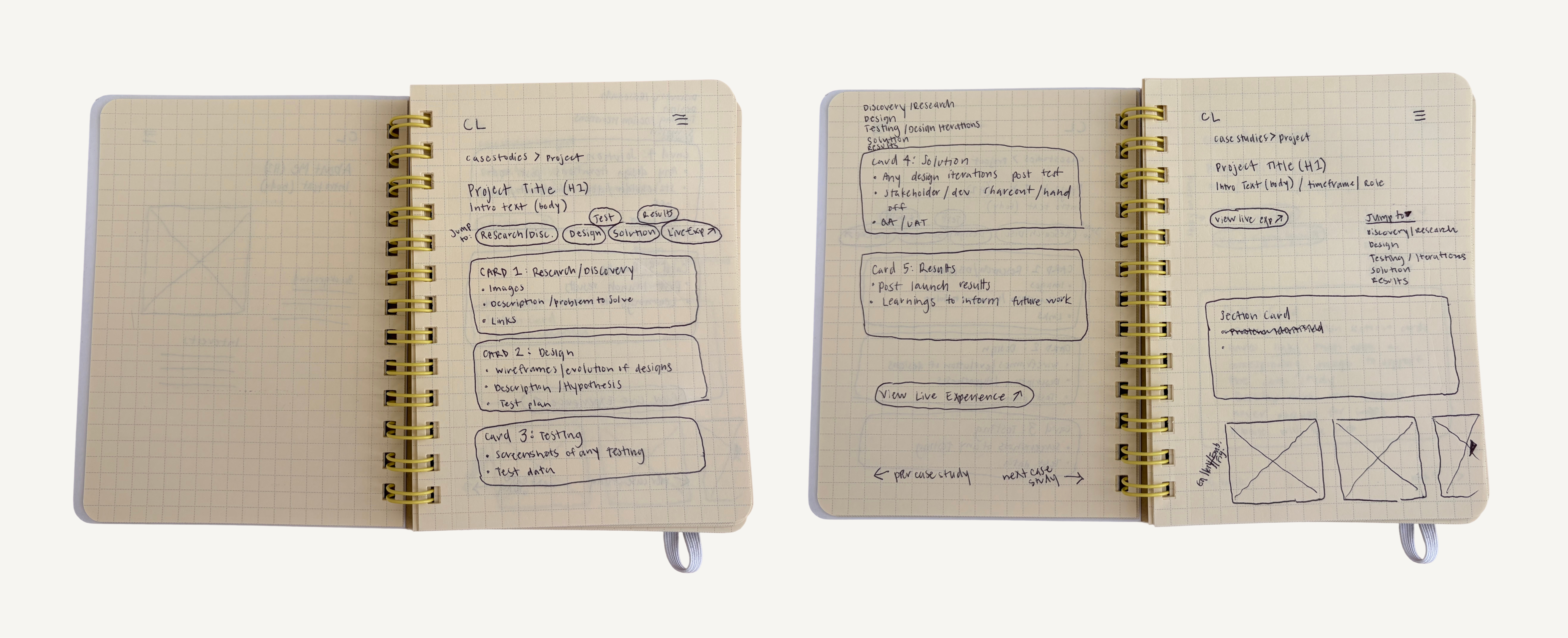
The idea started analog. Before opening Figma or any digital tool, I spent time sketching rough layouts, thinking about information architecture, and establishing what I wanted the portfolio to communicate. The sketches weren't precious — they were fast explorations of page structure, content hierarchy, and navigation patterns.
VISUAL DIRECTION
Editorial minimalism as a north star
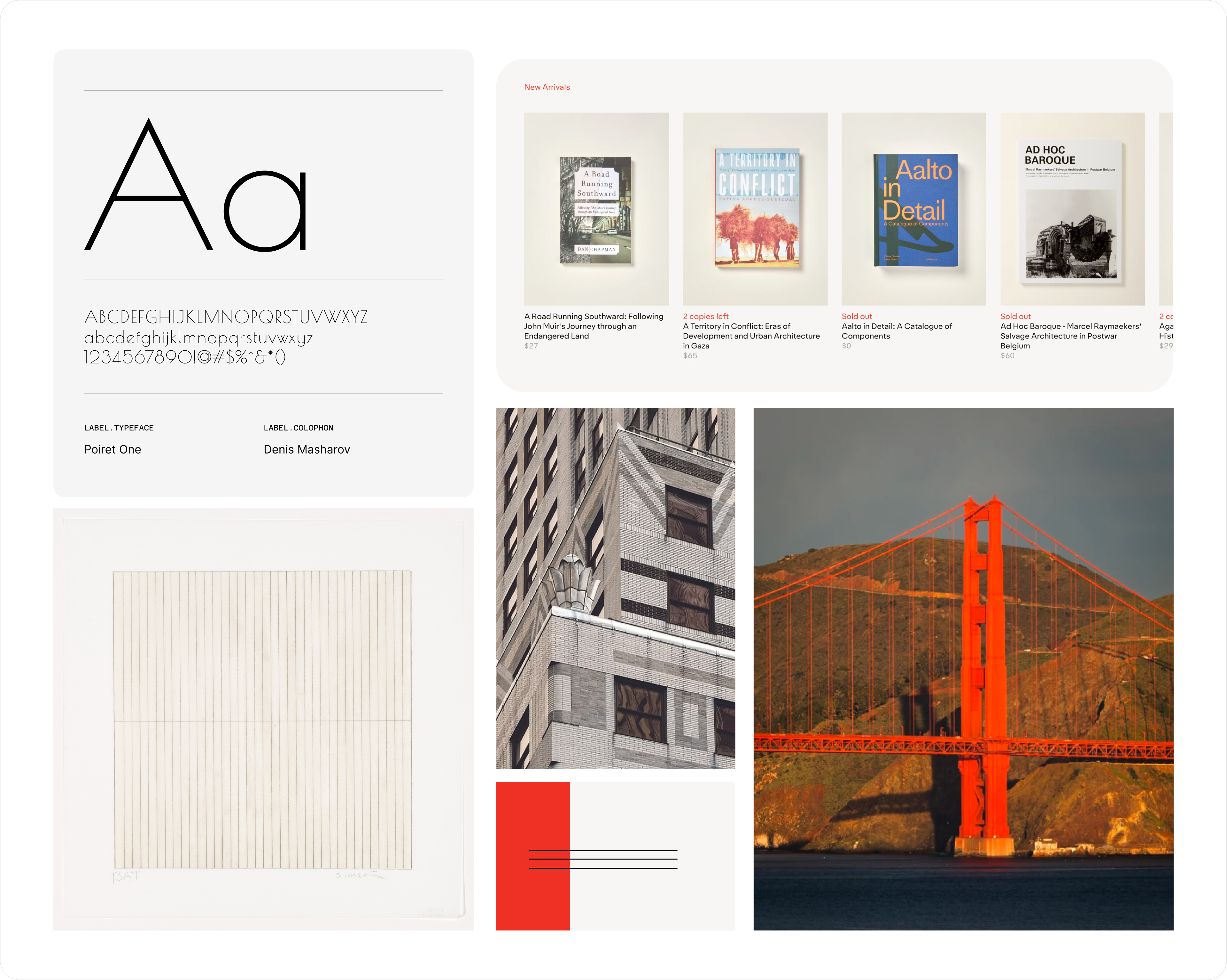
Inspiration gathering ran alongside sketching. The primary visual reference was Stout Books — its clean grid, confident type scale, and restrained palette. I also drew from editorial design and minimal commerce sites that prioritized typography and whitespace over decoration.
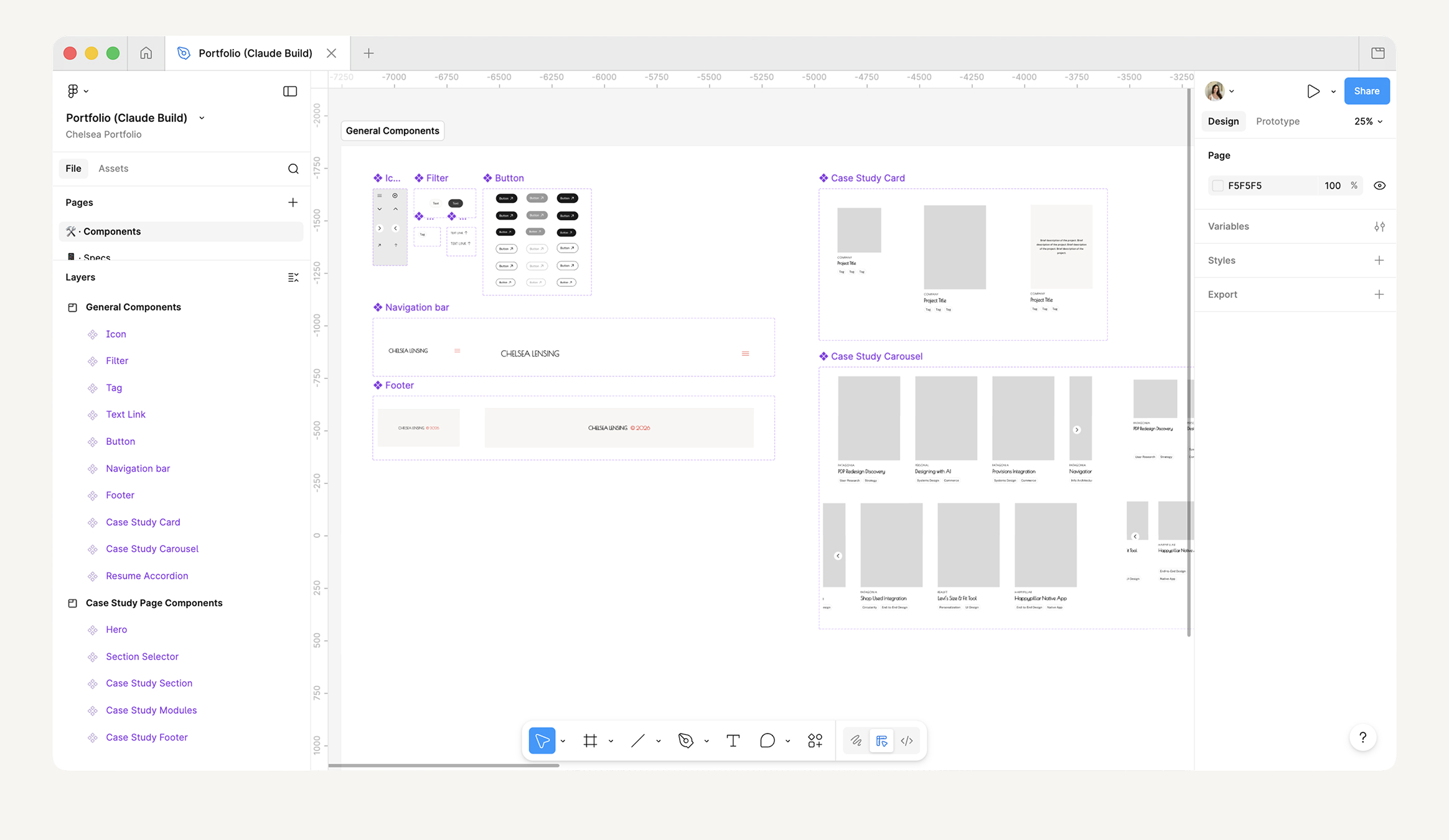
STEP ONE: COMPONENT LIBRARY
Designing the system before the screens
The design process followed a deliberate sequence: components first, layouts second. Before touching a single page, I built out the component library in Figma — defining type styles, color tokens, and spacing rules, then assembling them into the UI elements the site would be built from.
Every component was designed with code handoff in mind: consistent naming conventions, organized layers, and deliberate variant states. This up-front investment paid off throughout the build — both in Figma and in code.
STEP TWO: PAGE LAYOUTS
Assembling components into full site layouts
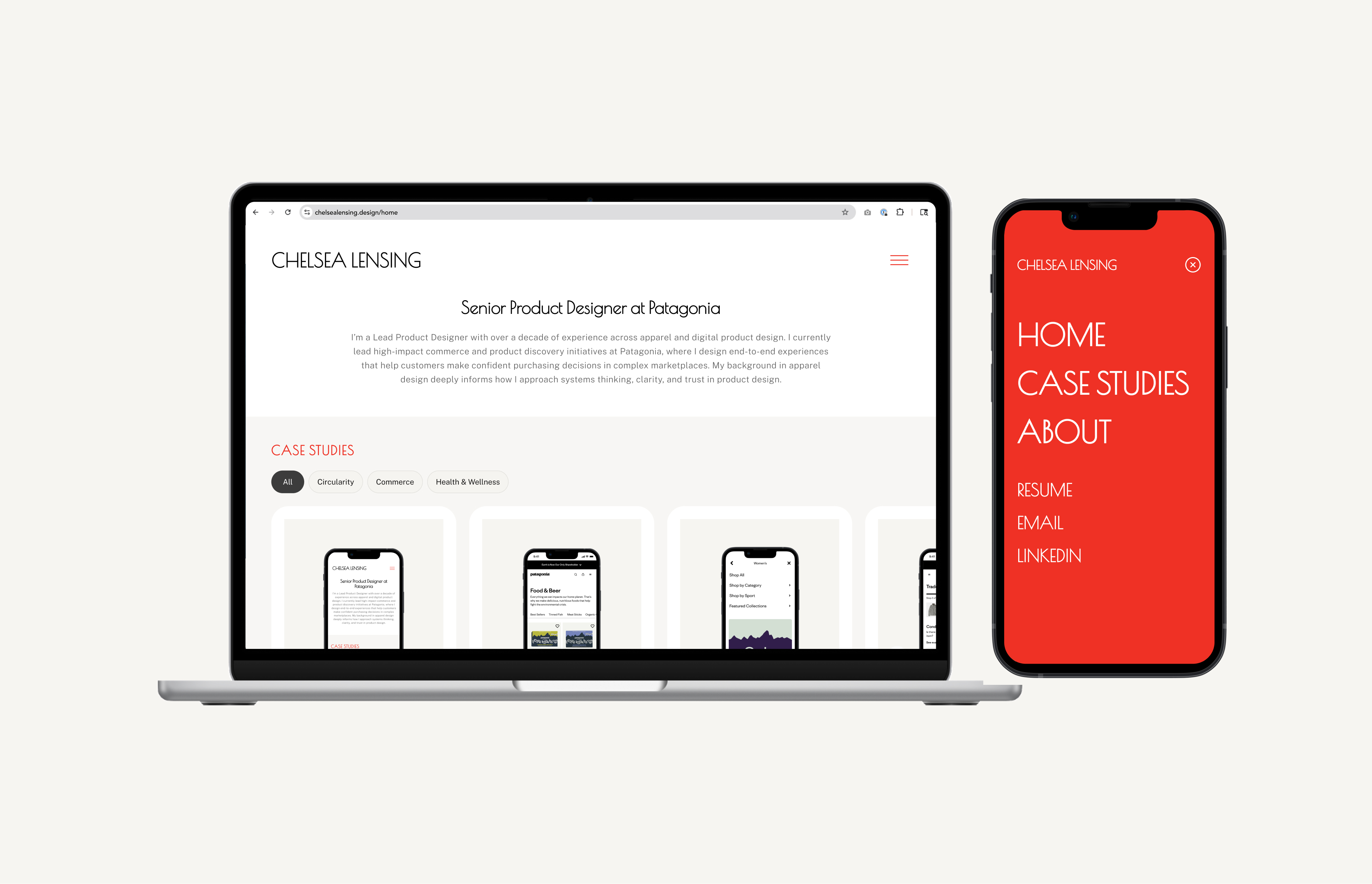
With the component library established, I moved into full page design — assembling components into the homepage, resume page, and overall site structure. Because the building blocks were already defined, layout decisions became faster and more consistent. The design language held together naturally because it was all pulling from the same system.
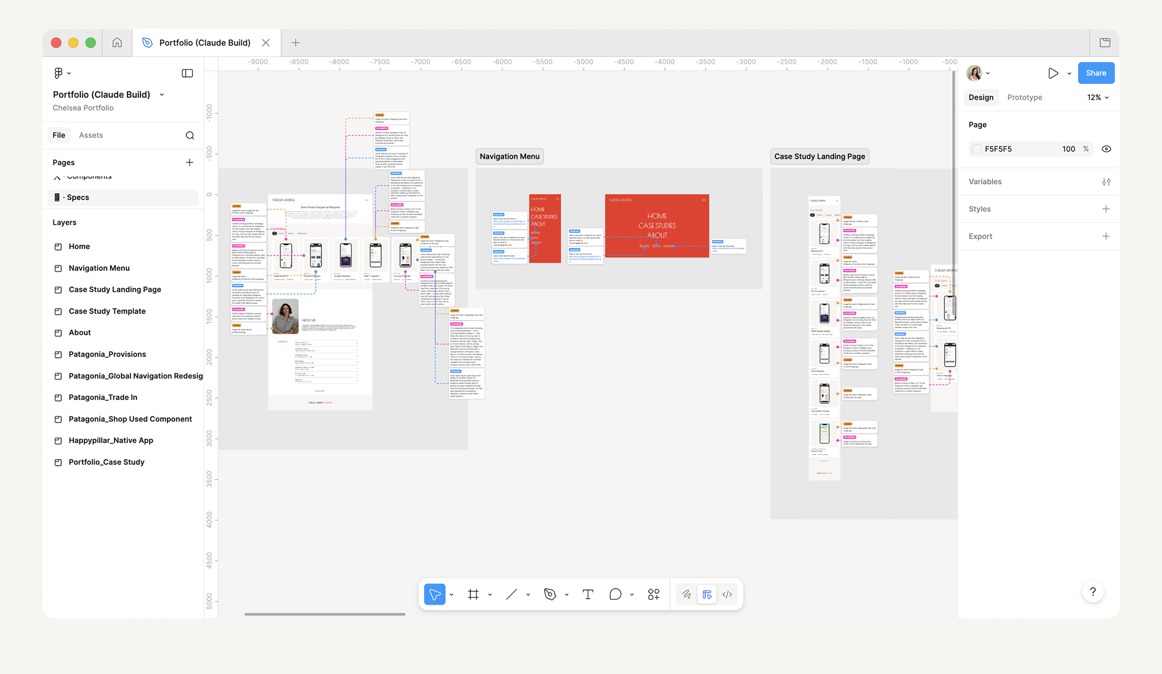
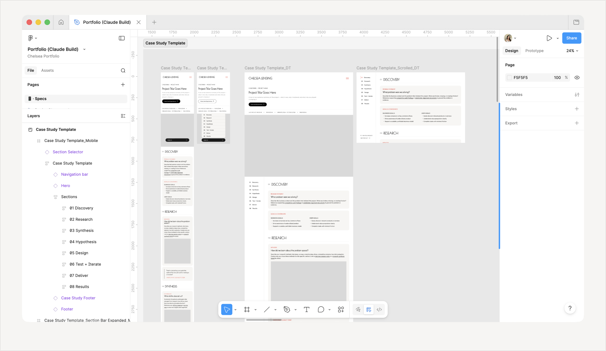
STEP THREE: CASE STUDY TEMPLATE
Designing a template that would scale
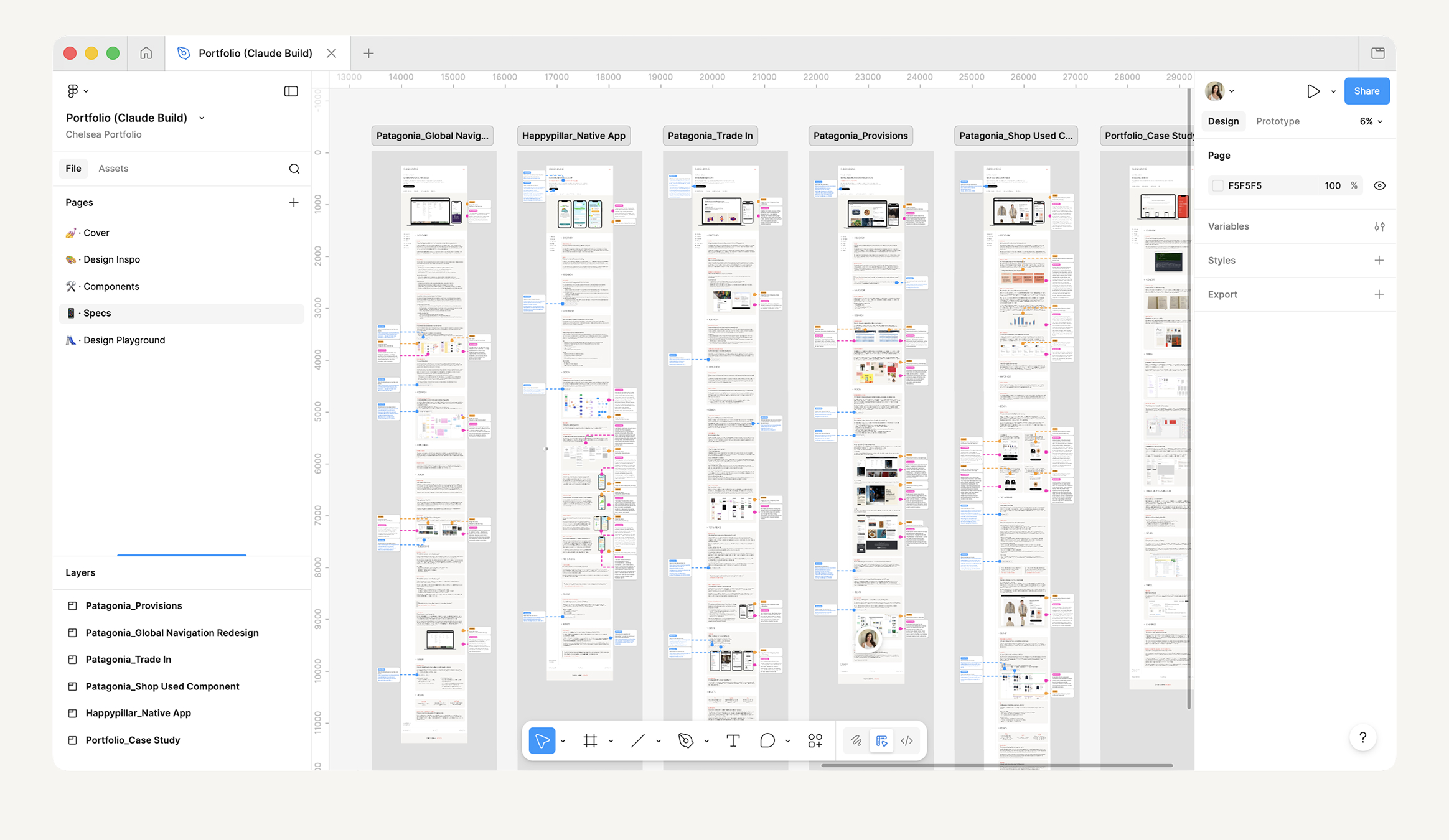
The case study page wasn't designed as a one-off — it was designed as a template. I built a reusable layout that could accommodate any project: a consistent structure for the hero, meta information, section content, image placements, and navigation. The template was intentional from the start, designed to be applied across every project highlighted on the site.
Once the template was built and validated in Figma, I used it to design each individual case study, keeping the experience consistent for visitors while allowing each project's content to breathe within the structure.
THE CORE WORKFLOW
Bridging design and code with AI
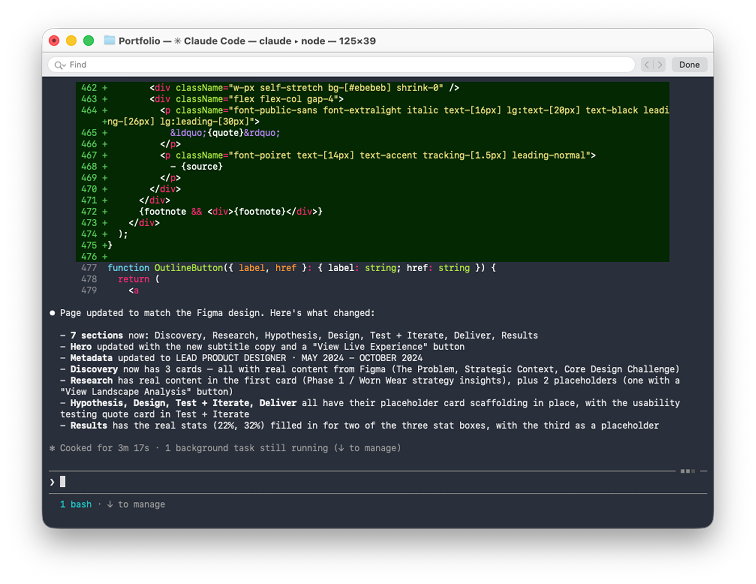
Rather than exporting assets and writing specs for a developer, I connected Figma directly to Claude Code using a Figma MCP (Model Context Protocol) server. This gave Claude Code live read access to my Figma file — so instead of describing my designs in text, Claude could see them.
Working in the terminal, I used Claude Code to translate Figma components into HTML and CSS, iterating in real time. When a layout didn't match design intent, I pointed to the Figma frame directly and asked Claude to reconcile the discrepancy. The workflow felt less like prompting a tool and more like working alongside a technical collaborator who had access to my design files.
KEY MOMENTS
What the workflow actually looked like
The process was iterative and genuinely collaborative:
- Establishing the MCP connection between Figma Desktop and Claude Code CLI
- Translating the component library into responsive HTML/CSS
- Iterating on type scale and spacing to match Figma intent in the browser
- Building the multi-page structure: homepage, case study pages, resume
- Working through React/component integration challenges collaboratively
VERSION CONTROL
Connecting the codebase to GitHub
With a working codebase taking shape, I connected the project to GitHub directly from the terminal. Using Git from the command line — guided by Claude Code when needed — I committed the site in logical increments, treating each component or page as its own unit of work.
For a designer accustomed to Figma's version history, Git introduced a more intentional relationship with change. Rather than autosaved states, each commit required naming and framing what had changed — a small discipline that reinforced clearer thinking about the work.
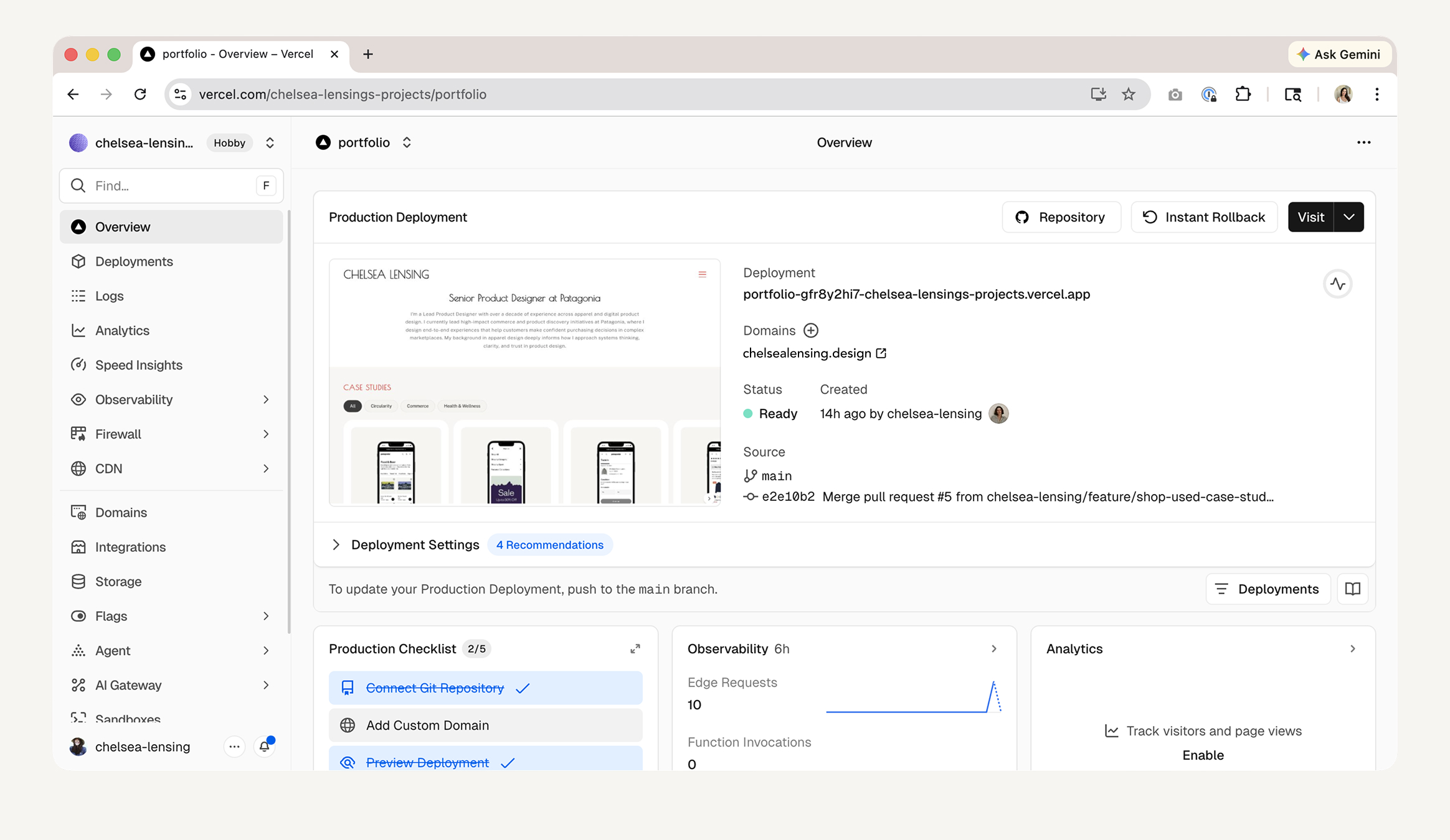
DEPLOYMENT
From repo to live site
Deployment was handled through Vercel, connected directly to the GitHub repository. Every push to the main branch triggered an automatic build and deploy — meaning the live site stayed in sync with the codebase without manual intervention.
SEEING THE WORK THROUGH A DEVELOPER'S EYES
The most valuable shift was in perspective
Working this deeply in the build layer gave me something I don't usually get as a designer: a firsthand view of what it actually feels like to work from a Figma file. When I was the one trying to translate my own designs into code, every ambiguity became immediately visible — missing states, inconsistent spacing, layers that weren't named with any intention. It was humbling in the best way.
This experience gave me a much deeper appreciation for the work developers do to interpret design files, and made clear how much friction lives in the gap between what a designer intends and what a developer can actually act on. Experiencing that gap from the other side changed how I think about handoff entirely.
FIGMA AS A COMMUNICATION TOOL, NOT JUST A DESIGN TOOL
Annotations and organization are the real handoff
As I worked deeper into the project, I started treating my Figma file differently. What began as a personal design document had to become something that could communicate clearly to another system. That reframing changed how I worked.
I began leaning more intentionally into Figma features: component descriptions and annotations to document behavior and intent, design tokens to keep color and spacing consistent across components, and more disciplined layer naming and grouping so the file's structure made sense at a glance. These aren't extras — they're what make the difference between a file that requires interpretation and one that speaks for itself.
The result was a smoother, more seamless transition between Figma and the shipped site. The better the file, the less translation was required — and the closer the final output was to what I'd designed.