TRADE IN INTEGRATION
Migrating Patagonia's Trade-In program from a standalone WornWear.com experience to the main Patagonia.com shopping ecosystem — leading to a 1.5x increase in overall trade-in orders submitted, setting up the brand for future used product integration on the website.
THE BRIEF
Bring circularity to the center of how customers shop on Patagonia.com
Patagonia's Trade-In program had lived on WornWear.com since its inception — a separate site, a separate mental model, a separate journey. For customers who discovered Patagonia through the main site, trade-in was effectively invisible. Phase 2 of Patagonia's circularity initiative set out to change that.
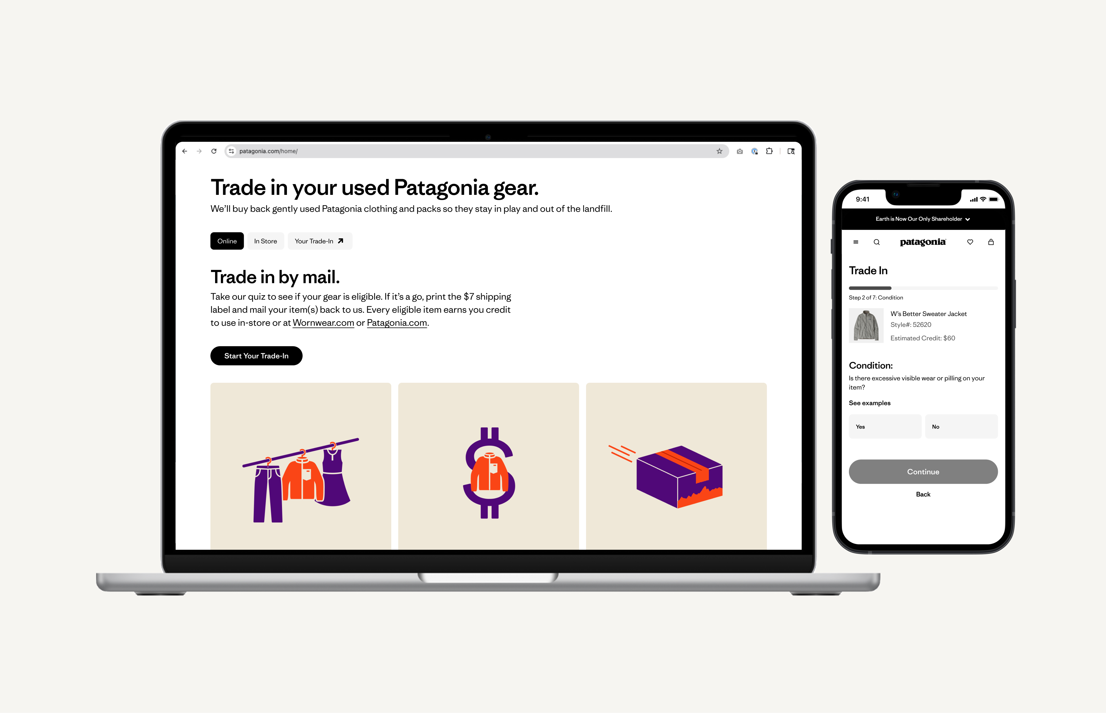
The goal was to migrate the Trade-In experience to Patagonia.com and meaningfully improve it — giving customers the ability to get an estimate before mailing or bringing gear to a store, trade in directly from past purchases in their account history, and track trade-in orders alongside their regular shopping.
STRATEGIC CONTEXT
Part of a larger circularity vision
This project sat within a broader strategic shift: building a brand ecosystem where circular services — repair, resale, trade-in — aren't peripheral programs but core to how customers engage with the brand over time. Trade-in integration was identified as a key differentiator for driving retention, with data showing that customers who redeem trade-in credits spend roughly double the value of the gift card — the highest redemption lift of any type of merch credit.
UNDERSTANDING THE BEFORE STATE
What the WornWear.com experience revealed
Before defining the new experience, I grounded the work in what we knew about the existing trade-in flow on WornWear.com.
Key structural gaps:
- No way to access trade-in from Patagonia.com — customers had to know WornWear existed
- No item lookup by order history — customers had to locate their own style numbers
- No way to track trade-in status within an account
- Eligibility criteria were unclear before starting, leading to high rejection rates (35% digital, up to 50% in-store)
- Shipping label printing was a recurring friction point
PRE-INTEGRATION SURVEY
Benchmarking the current experience before redesigning it
In parallel with design, Patagonia's Customer & Market Insights team ran a survey on the existing WornWear.com trade-in experience from February to March 2025 — capturing data at four touchpoints: confirmation, received, accepted, and rejected. 99% of respondents had made multiple Patagonia purchases. This was our pre-integration baseline — directly informing which problems the new design needed to solve.
Key Findings
- 69% completely confident after initiating — but shipping label printing was the single biggest confidence-killer
- 78% of accepted users said they'd trade in again vs. only 16% of rejected users. Rejection language was vague — customers wanted to understand why, not just that their item wasn't accepted.
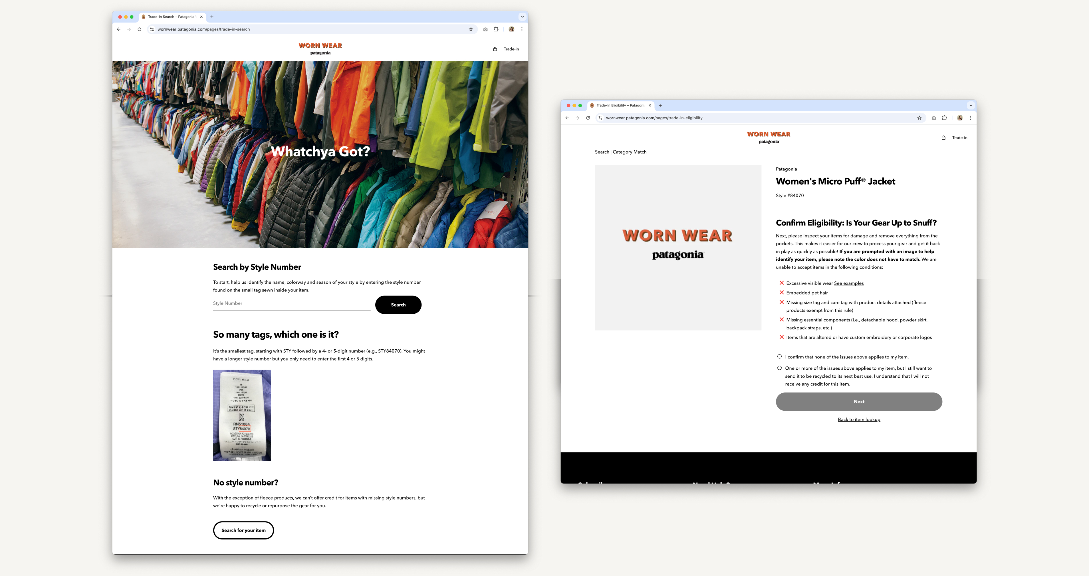
- Style numbers were a major friction point. Users had difficulty finding them, some with worn or unreadable labels. The WW experience provided no guidance.
- Environment (61%) and trust in Patagonia (59%) were the top motivations. Convenience ranked last at 32%. This shaped how we framed the experience: values-forward, not transactional.
COMPETITIVE & LANDSCAPE ANALYSIS
Best-in-class trade-in and resale experiences
I built a best-in-class landscape board spanning trade-in programs, resale platforms, and eligibility quiz patterns to identify design conventions customers already understood, and opportunities where Patagonia could do meaningfully better. This informed early structural decisions about the quiz format, landing page layout, and how to handle ineligible outcomes.
View Landscape AnalysisPROBLEM STATEMENT
Trade-in was invisible to most Patagonia customers — and confusing to the ones who found it
Patagonia's trade-in program lived on a separate site, making it effectively invisible to customers most likely to use it. For those who did find WornWear.com, the experience lacked the guardrails to set expectations and reduce rejection: no upfront eligibility guidance, no style number help, no way to track progress or return to an in-progress trade-in, and unclear post-rejection communication that damaged loyalty.
DESIGN HYPOTHESIS
If we make trade-in native to Patagonia.com, more customers will engage — and succeed
By integrating trade-in directly into Patagonia.com with a guided eligibility quiz, multiple access points (navigation, account, footer), and a dedicated trade-in order history in account, customers would be able to discover, complete, and track trade-ins without friction. A better-qualified funnel — not just more volume — would reduce rejection rates and build repeat trade-in behavior.
Success Measures Defined:
- 20% increase in average monthly digital trade-ins (translating to ~11k unit annualized inventory increase)
- Reduce digital rejection rate from 35% → 15% through improved UX with eligibility quiz
- ~$0.9M in projected incremental annual sales (assuming 90% sell-through)
INFORMATION ARCHITECTURE
Entry points, landing page, and quiz architecture
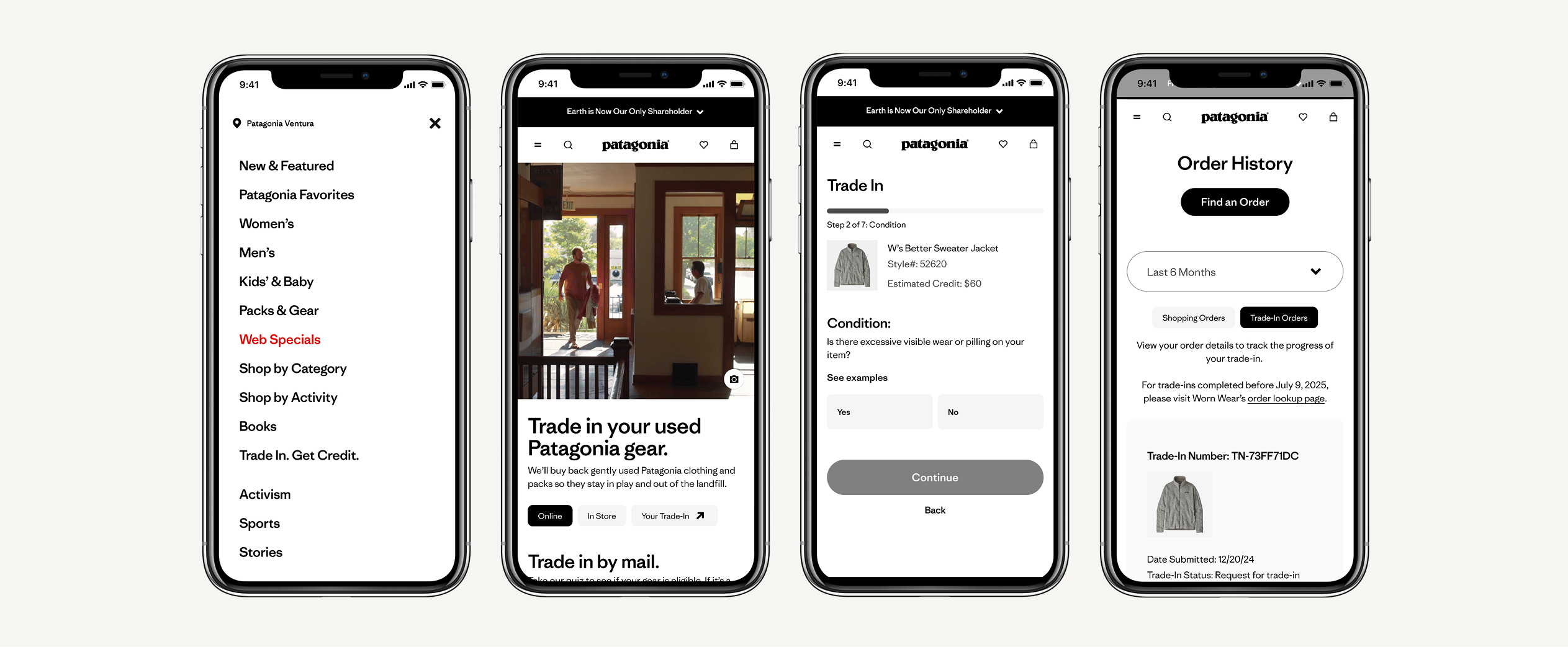
The new experience supports three distinct entry points: search, a footer link (‘Trade In, Get Credit’), and a navigation text link. Each leads to the Trade-In landing page, designed around two parallel funnels: online mail-in and in-store.
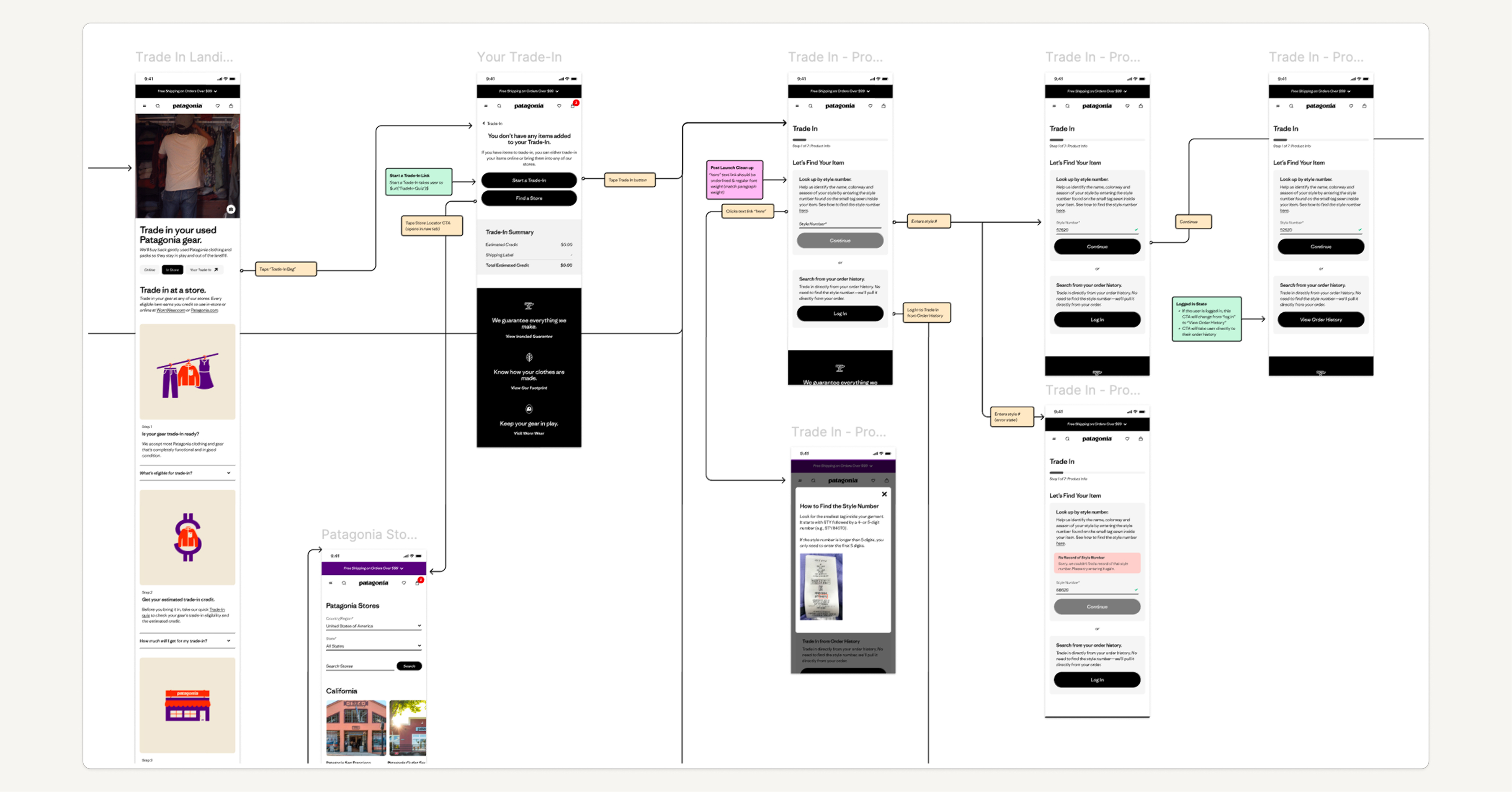
The eligibility quiz architecture was the most technically complex design challenge — handling two item lookup methods, five condition questions, three types of ineligible outcomes with contextual off-ramps, and an eligible path through to a trade-in bag, checkout, and confirmation. I mapped every state and branch into detailed decision tree documentation before moving to wireframes.
LO-FI WIREFRAMES
From structure to flow
Starting from napkin sketches and decision trees, I developed lo-fi wireframes covering the full end-to-end scope: the Trade-In landing page (online and in-store tabs), the eligibility quiz (all states and branches), the Trade-In bag, checkout, confirmation, and trade-in order history in account. The lo-fi phase was about stress-testing information hierarchy and flow logic before investing in visual execution.
KEY DESIGN DECISIONS
What the design had to get right
1. Dual-funnel landing page:
The landing page was designed around two tabs — Online and In Store — giving customers immediate clarity about which path applied to them. Both tabs share a common structure: eligibility, estimated trade-in value, and a step-by-step process, with the online tab leading directly into the quiz.
2. Account integration for item lookup:
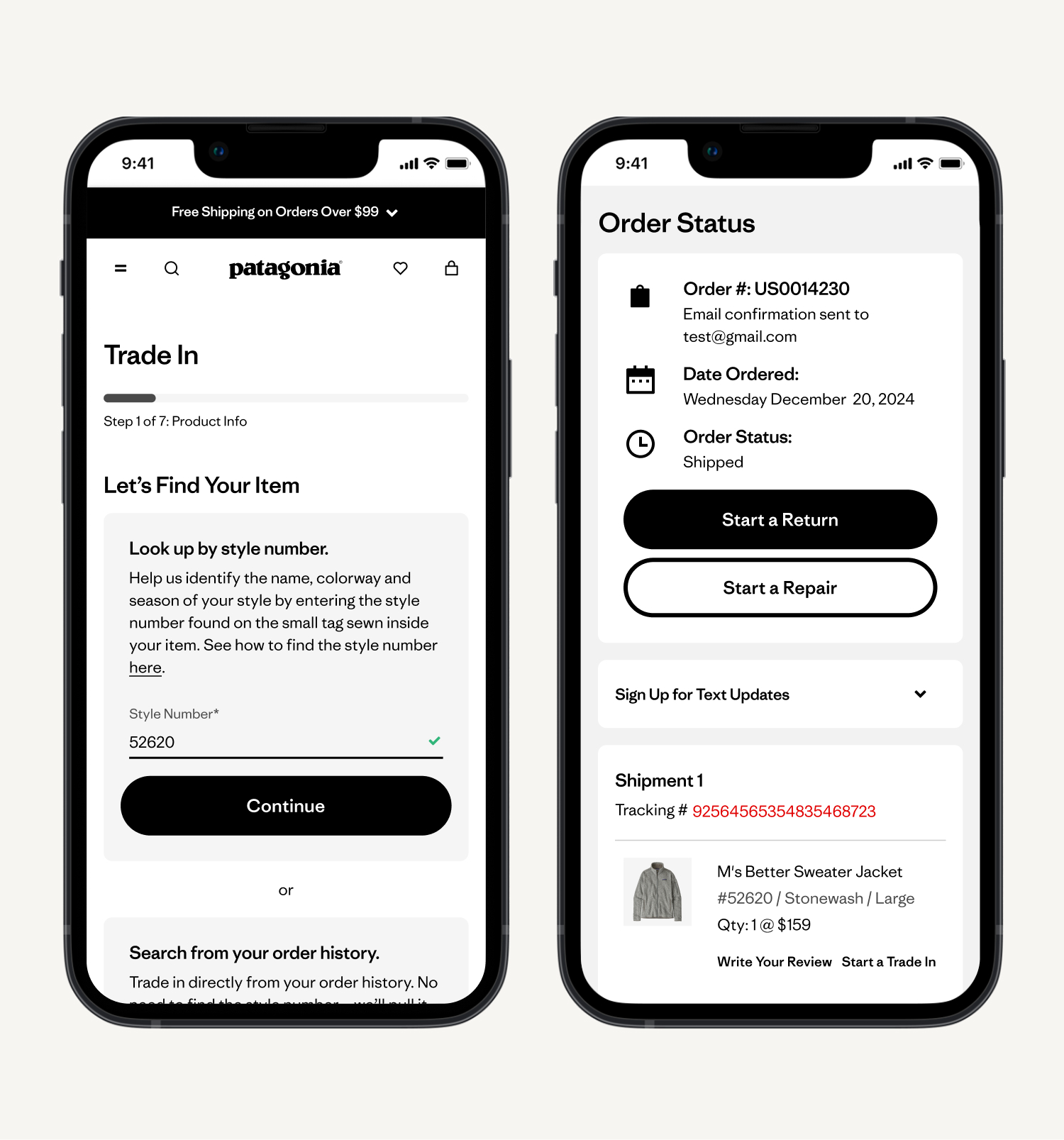
Rather than requiring customers to know their style number, the quiz offered a second entry: logging into account and selecting from order history. For eligible items, clicking 'Start a Trade-In' carries the product image, name, and estimated credit directly into step 2 of the quiz — dramatically reducing manual input friction.
3. Ineligible outcome off-ramps:
Rather than dead-ending customers whose items didn't qualify, the ineligible result screen provided contextual alternatives: repair services, donation options, in-store recycling with a store locator link, and the ability to add another item. This directly addressed the survey finding that rejected customers felt abandoned.
4. Trade-In order history in account:
A new 'Trade-In Orders' tab in account order history gave customers a dedicated place to track trade-in status, reprint shipping labels, and see credit amounts once issued. This closed the loop on a gap the WW survey had clearly surfaced: no reliable way to track what happened after mailing an item.
5. Estimated trade-in value, upfront:
Both landing page paths surface estimated credit ranges before any commitment is made. This transparency, absent in the previous experience, was designed to set expectations and reduce disappointment downstream.
MID-FI WIRES & PROTOTYPE
Building fidelity for testing
With the lo-fi structure validated internally, I developed mid-fi wireframes and an interactive prototype across the full trade-in flow — landing page, eligibility quiz (all paths), trade-in bag, checkout, confirmation, and account trade-in history. The prototype was built to the fidelity needed to surface real usability issues: enough detail to feel like a real product, without the overhead of full visual design. This became the artifact used for usability testing.
USABILITY TESTING
Validating the prototype before development handoff
I ran an unmoderated usability test on the mobile prototype with 5 participants — following the 5-user rule for identifying the majority of usability issues. 60% knew that Patagonia offered trade-ins before the test. Participants completed four tasks: find Trade-In, start a trade-in without completing checkout, browse jackets, then return to trade-in and complete checkout.
Synthesis combined quantitative survey ratings with qualitative affinity mapping of session recordings, surfacing five themes:
1. Finding the Trade-In Program:
Most users looked for trade-in in the navigation first, with some expecting it on the homepage or footer. Despite variation in approach, users found it easy to locate. 80% rated discovery as 'very easy' (5/5).
2. Landing Page First Impressions:
Users found the page well-organized, clear, and informative. One issue surfaced: the term 'prepaid shipping label' was perceived as misleading since the cost is deducted from trade-in credit. → Removed 'prepaid' from the label language.
3. Understanding Eligibility:
The quiz was perceived as simple and intuitive. 100% of participants rated determining eligibility as 'very easy.' Some wanted more clarity on specific deal-breakers like missing size tags.
4. Returning to the Trade-In:
Several users struggled to find their Trade-In bag after navigating away — often checking the shopping cart first. 80% ultimately rated returning as easy (4/5), but the friction was real enough to warrant follow-up action.
“It was very easy to understand if my item was eligible for trade in.”
-PARTICIPANT IN USABILITY TESTING
ITERATE — TERMINOLOGY SURVEY
One finding led directly to a follow-up study
Theme Four surfaced a naming problem: ‘Trade-In Bag’ — the label for the in-progress trade-in cart — caused confusion. Some users thought it referred to a physical mailing bag. Rather than make an internal judgment call, I ran a 30-participant terminology survey on UserTesting.com to test four options.
‘My Trade-In’ won with 43.3% of participants — nearly double the next choice (Trade-In Cart at 26.7%). The name was updated before handoff. This detail matters: it's the persistent navigation element customers use to return to an in-progress trade-in, and getting it wrong would have caused ongoing drop-off.
RESEARCH → DESIGN TRACEABILITY
Closing the loop between research and design changes
The WornWear.com baseline survey surfaced two friction areas the new design directly addressed:
- Shipping label printing: The new experience enables label printing from both the order confirmation page and Trade-In order history — the two moments customers need it most.
- Style number difficulty: The quiz provides a ‘how to find your style number’ modal, and the account-based lookup eliminates the need to locate it at all for returning customers.
This research-to-design traceability was shared in leadership reviews — showing explicitly how the new experience addressed documented customer pain points from the live experience.
DELIVERABLES
What I produced for handoff and launch
- Full Figma spec documentation — mobile and desktop
- Annotated interaction behaviors for all component states
- Decision tree documentation for quiz branching logic
- Eligible and ineligible outcome flows
- Account integration specs (order history, trade-in tab)
QA & MONITORING
Ensuring quality through launch and beyond
I led design QA in the staging environment before moving to UAT, catching outstanding UI bugs and issues requiring UX sign-off before Business stakeholder approval. Post-launch, performance monitoring tracked trade-in volumes, rejection rates, and customer contacts.
3×
Increase in trade-in page visitors since launch (57k vs. 17k pre-launch avg)
28%
Reduction in digital rejection rate post-launch (35% → 25%, with a goal of reaching 15%)
1.5×
Increase in overall trade-in orders submitted (initial readings)
BUSINESS IMPACT
Integration made trade-in visible — and drove real business value
The Trade-In landing page saw a 3x increase in visitors compared to the pre-launch 30-day average — 57,000 vs. 17,000 — with 46% of those visitors new to Patagonia.com entirely. Beyond trade-in activity itself, $81.6k in mainline site revenue was generated by traffic that came through the trade-in experience, demonstrating a halo effect the previous WornWear.com experience couldn't produce.
Initial readings showed a 1.5x increase in overall trade-in orders submitted. August digital trade-in unit volumes were up 29% year-over-year, tracking toward the 20% annualized inventory growth goal set at launch.