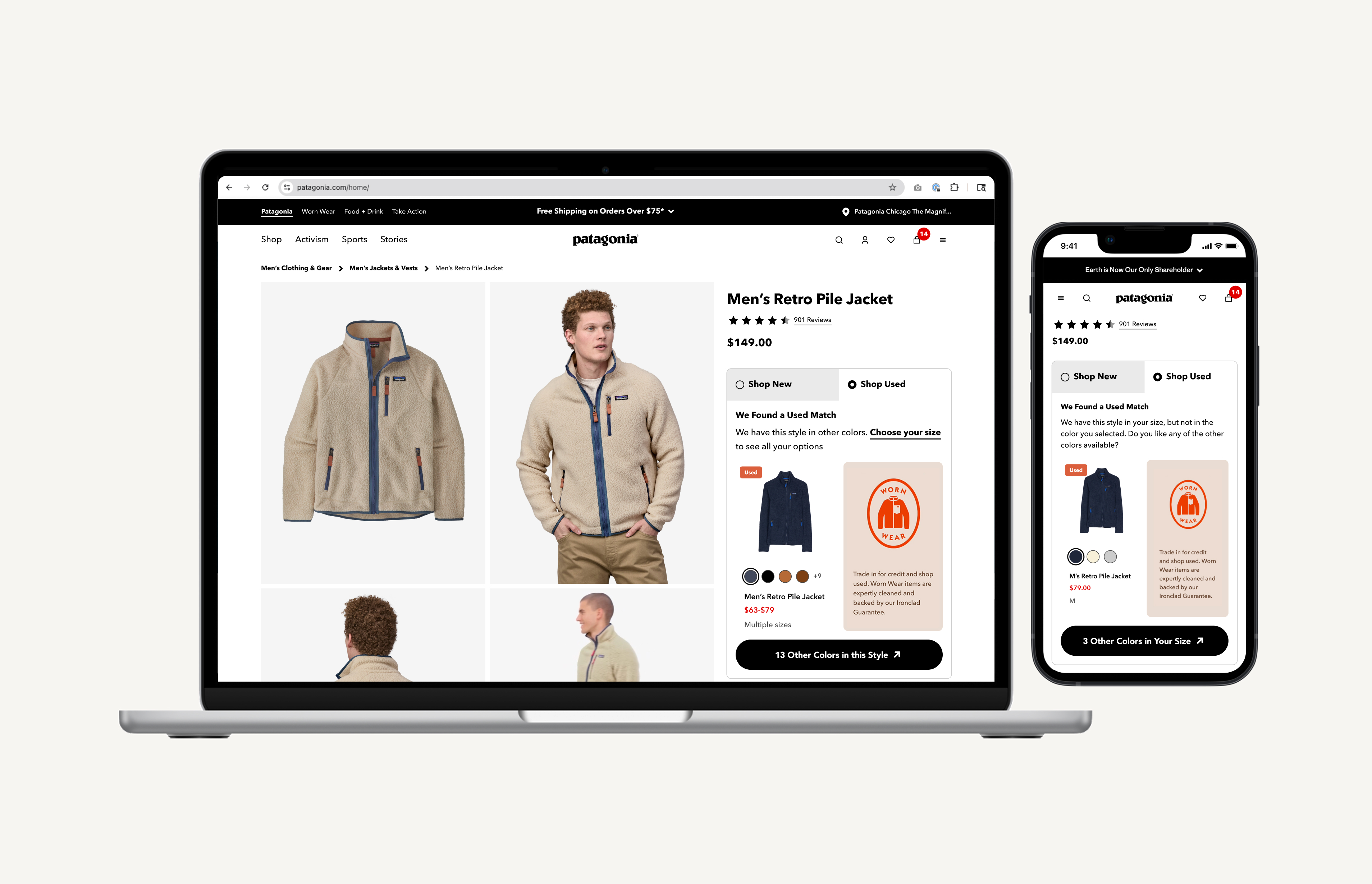
SHOP USED PDP COMPONENT
Designing a responsive ‘Shop Used’ component that surfaces secondhand inventory directly on Patagonia.com product detail pages — making resale visible, credible, and actionable at the moment of purchase consideration.
THE PROBLEM
Resale was invisible at the moment it mattered most
Before this project, customers shopping on Patagonia.com had no way to encounter used products. The only path to resale was through a global navigation link that took them off Patagonia.com entirely and onto WornWear.com — a separate site, a separate mental model, a separate journey. Most customers shopping a new jacket never knew a used version existed.
The result was a structural gap: resale was invisible during one of the most important decision-making moments in the customer's path to purchase. Patagonia had no data on how customers would evaluate used options alongside new, and no surface to test it on.
STRATEGIC CONTEXT
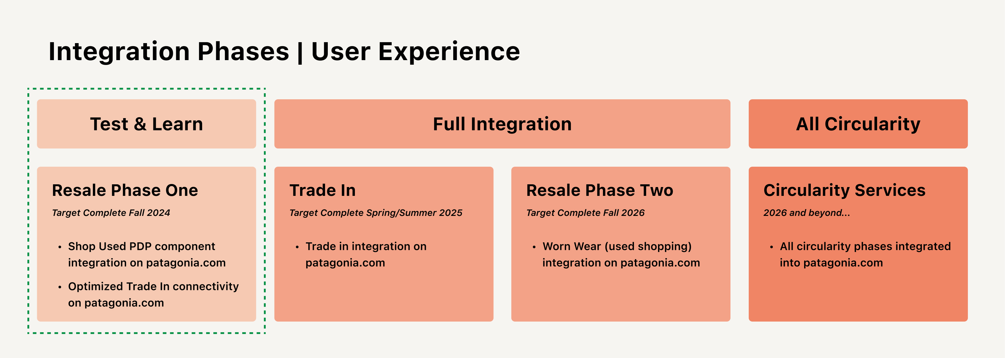
The 'Test & Learn' phase of Worn Wear integration
This project was Phase 1 — the ‘Test & Learn’ — of Patagonia's Worn Wear integration strategy, with the PDP chosen as the starting surface because purchase intent is highest there. The broader integration roadmap spanned four stages: Test & Learn (PDP component), Full Integration (Trade-In and Resale Phase Two on Patagonia.com), and All Circularity (full circularity services integrated). This case study covers the Test & Learn phase.
AUDIENCE & COMPETITIVE RESEARCH
What the data told us about who we were designing for
Before component design began, I consumed a foundational audience research report produced by Patagonia's Insights & Analytics team — combining an influence mapping framework, digital audience data via SparkToro, and a Worn Wear Messaging Survey. This research shaped what the component needed to communicate, not just what it needed to show.
A key insight from the audience profile: the Worn Wear audience shares a similar digital behavior profile to the main brand, but with a higher affinity for discounts, value, and sustainable fashion. They do brand, price, and product discovery across specialty retail sites, gear review sites, ethical shopping apps, and third-party resellers — meaning many potential Worn Wear customers were already comparing Patagonia gear against eBay and Poshmark listings before ever encountering Worn Wear directly.
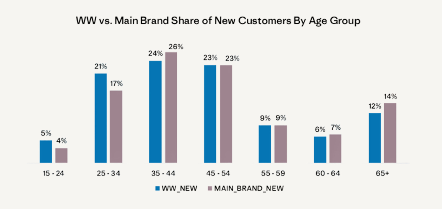
Insights also identified Worn Wear as a potential acquisition engine for Patagonia — broadening the customer base where price is a barrier and appealing to younger customers excited to participate in the circular economy. Worn Wear's customer base skews younger — over 80% of under-35's shop used clothing at least a few times a year — and repeat Worn Wear customers deliver comparable lifetime value to main brand repeat customers, with 29% of repeat WW customers having 10+ lifetime orders vs. 18% of mainline customers. This was as much an acquisition and retention play as a circularity one.
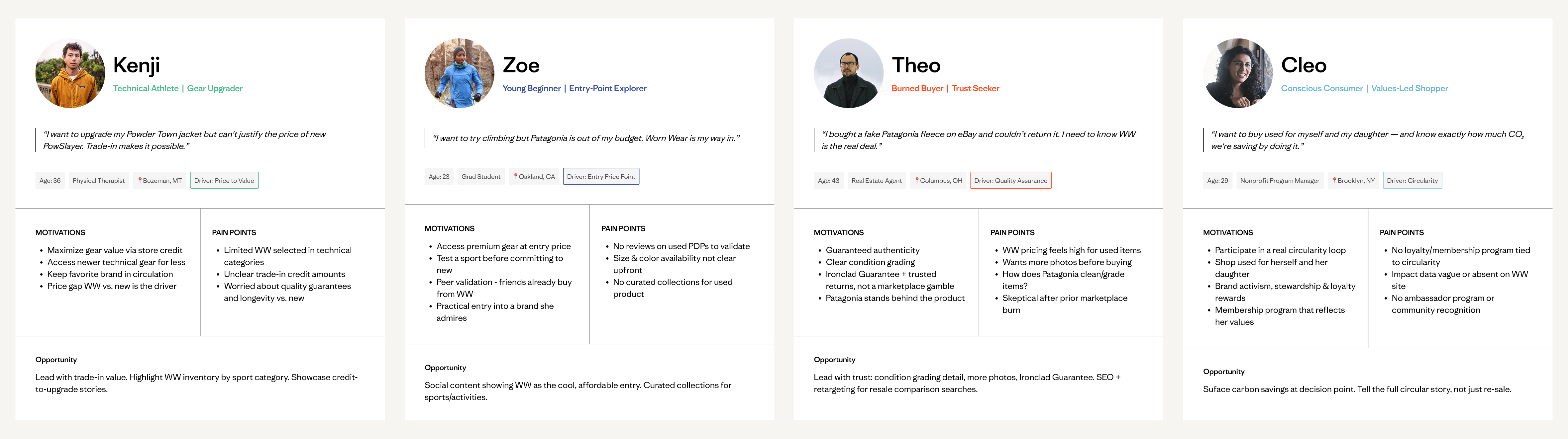
AUDIENCE PERSONAS
Four personas developed to ground the integration vision
In parallel with the component design, I developed four customer personas synthesized from the insights research, internal analytics, and business goals. These personas were developed as forward-looking artifacts to keep the full range of Worn Wear customers visible throughout design decisions, even as Test & Learn phase constraints limited scope to the PDP component alone. They went on to anchor the Full Integration phase roadmap and journey mapping work.
THE CORE DESIGN CHALLENGE
Most inventory isn't a perfect match
The vast majority of Worn Wear inventory does not have a perfect style-color-size match to new Patagonia products. If the component only surfaced perfect matches, it would be empty most of the time and functionally useless at scale. This raised the central question: would customers meaningfully consider used options if they weren't exact matches? The answer needed to come from research before any design decisions could be made.
PROBLEM STATEMENT
Customers shopping on Patagonia.com were never exposed to used alternatives at the moment of highest purchase intent. The path to resale required leaving the site entirely, keeping resale invisible to the majority of Patagonia.com shoppers and leaving a significant acquisition and retention opportunity unrealized.
DESIGN HYPOTHESIS
Implementing a ‘Shop Used’ component on Patagonia.com PDPs — in partnership with Trove — would make resale visible at the moment of consideration, drive qualified traffic to Worn Wear, and generate the behavioral data needed to inform future integration phases. The component needed to remain useful across the full range of inventory availability, and not disrupt the primary purchase flow.
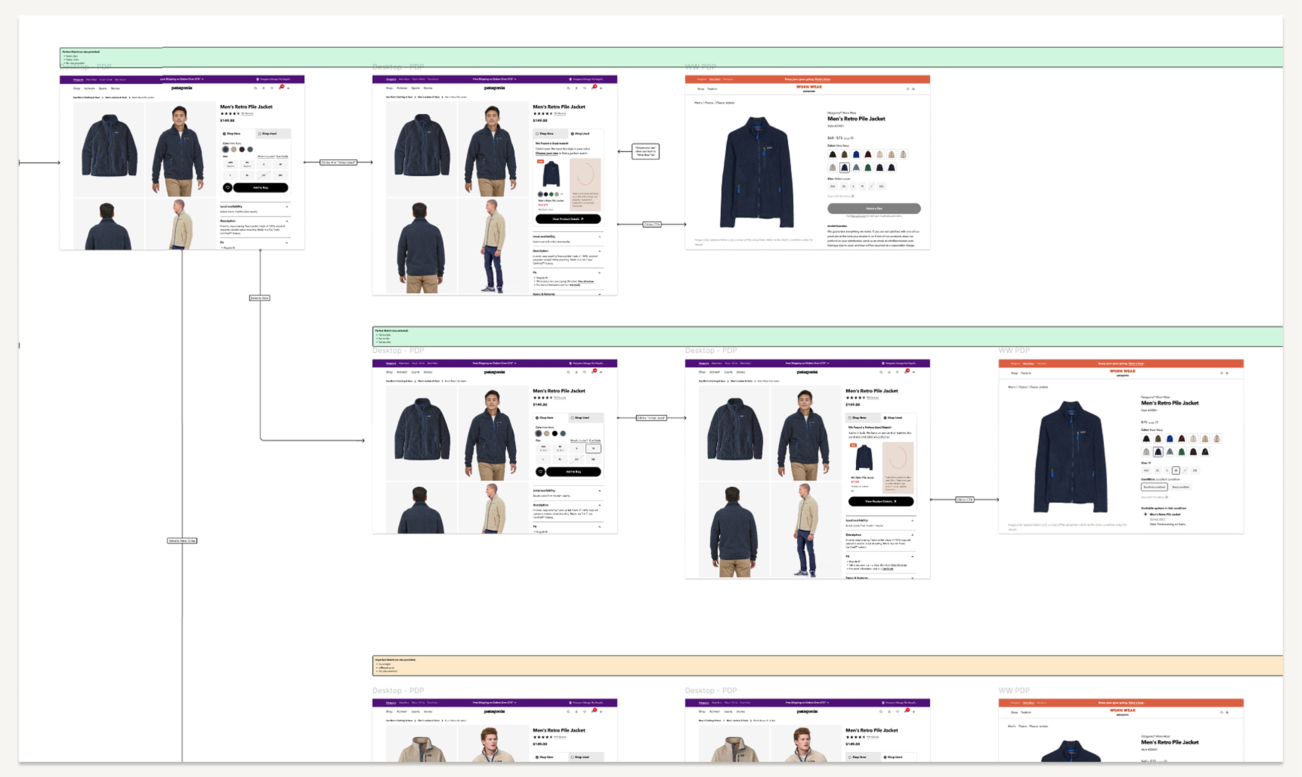
DESIGNING FOR LOGIC
A single component that adapts to real inventory
One of the most significant design challenges wasn't visual — it was logical. The component needed to handle every possible inventory state gracefully: a customer who hadn't selected a size yet, one who had an exact used match, one whose size had no exact match but similar products existed, and one browsing a category where used inventory wasn't available at all. Each state required its own distinct UI, copy, and behavior.
The matching hierarchy was built on a working assumption — that customers would prioritize size over color — which shaped the cascade: the component always attempts the most specific match first, stepping down to broader alternatives rather than disappearing when inventory isn't ideal. The usability study later confirmed this assumption and solidified the logic before development handoff.
The matching logic for each state was defined precisely:
- New Tab State
Customer lands on a PDP and sees a new tabbed buying cluster for Shop New and Shop Used. Shop New is selected by default.
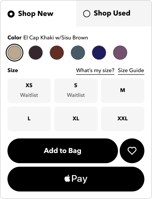
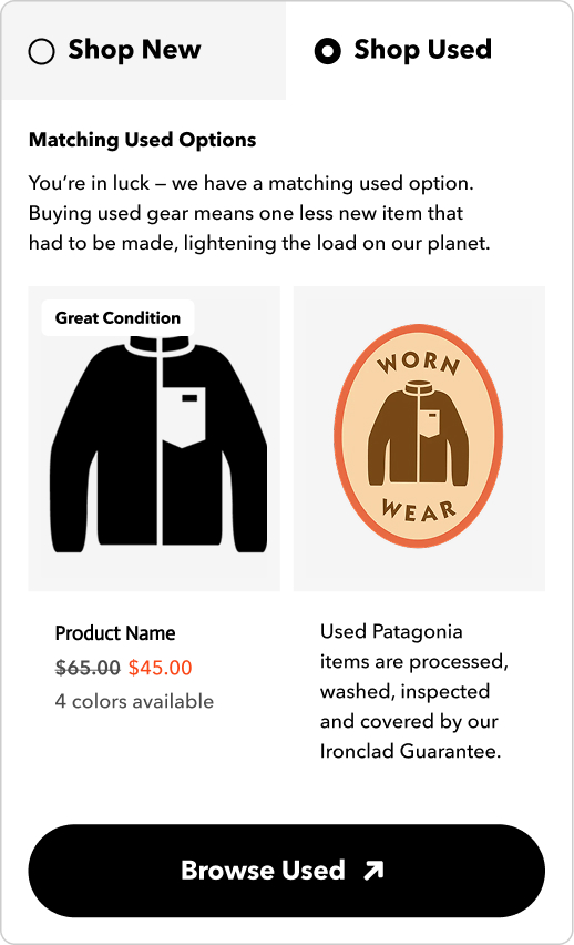
- Exact 1:1 Match
A used item matching gender, SKU, and size is available. The used tab surfaces the item with condition grade, price, available colors, and a direct path to Worn Wear.
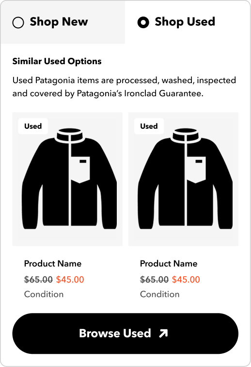
- Similar Match
Size is selected but no 1:1 match exists. Shows used options matching gender, product sub-category, and category — labeled ‘Similar Used Options’ and framed as a curated recommendation, not a consolation.
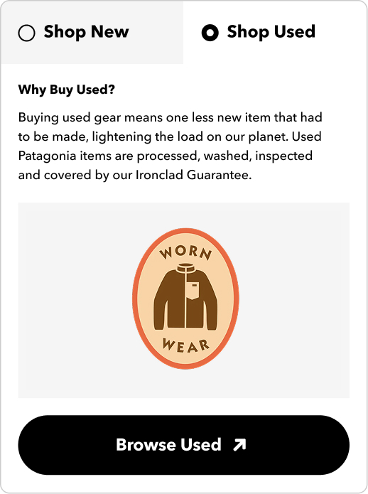
- No Used Results
For ineligible categories or zero inventory across all tiers, the component surfaces ‘Why Buy Used?’ copy — maintaining program awareness and using an empty moment to educate rather than abandon.
MID-FI WIRES & PROTOTYPE
Building fidelity for testing
Before moving to testing, I developed mid-fi wireframes and an interactive prototype across all four component states for both mobile and desktop. The prototype was built to the fidelity needed to surface real usability issues with the component logic and interaction model, without the overhead of full visual design. This became the artifact used in the usability study.
View PrototypeUSABILITY TESTING
Testing the component states with real customers
A planned usability study was scoped around three core goals:
- Understand customer response to matching scenarios — perfect vs. similar — to support used recommendation logic
- Understand how new vs. returning customer types engage with the component
- Understand user purchasing behavior to inform UI for future integration work
I designed and ran an unmoderated usability study with 10 participants — an even split of customers familiar and unfamiliar with Worn Wear. The test moved through four stages: first impressions on the PDP with the component, exploration of new and used options side by side, comparison questions, and open feedback. Synthesis surfaced four general themes:
1. Motivation (to shop used):
- Navigation & comparison: Customers want clear information and to compare new and used on the same page
- Money savings: Cost savings drive shopping used — customers compare new vs. used pricing to assess value
- Size importance: Customers will not compromise on size when buying used over new
2. Compromise (when shopping used):
- Different colors: 100% said they'd consider the same style in a different color if their size was available
- Similar styles: 100% would consider a similar style if their size was available and the product felt comparable
3. Trust (in buying used from Patagonia):
- Condition info: Customers prioritize condition details
- Ironclad Guarantee: The Guarantee reassures customers when evaluating used items — and many didn't know it applied to used
4. Nice to Have:
- Stock notifications: Three customers mentioned they'd appreciate in-stock notifications for used items
- Trade-in awareness: Trade-In placed in proximity to Worn Wear content positively increased awareness of both programs
“If it's similar in style, who knows I might like it better — if the price is right, the color's right, the size is right, why not?”
- PARTICIPANT IN USABILITY TESTING
“I'm more likely to buy used when they are side by side like this and I don't have to go to the Worn Wear portion of the website.”
- PARTICIPANT IN USABILITY TESTING
ITERATE
One design change, driven by a clear insight
Adding ‘Select Your Size’ to Used Tab: When a customer lands on the Used Tab in the PDP without selecting a size, the component was updated to actively prompt size selection. Because size is the most critical factor in surfacing a relevant used result, nudging customers to select their size earlier improves the quality of the used recommendation they see and reduces time spent in the lower-fidelity Similar Products state.
This change reflected the core insight directly: customers are open to similar items, but only if size is available. Getting size selection to happen earlier in the browsing flow meant more customers would see a higher-quality match — or know sooner that one wasn't available.

STAKEHOLDER COLLABORATION
Built across Patagonia, Trove, and multiple internal teams
This project required close partnership across Engineering, Merchandising, the Worn Wear team, Trove, and Brand Creative. I presented design directions and usability findings at leadership reviews throughout, and collaborated directly with Trove on ensuring the design could adapt to the technical realities of how Worn Wear inventory is structured and surfaced at scale.
HI-FI SPECS
Full specifications across mobile and desktop
With the logic confirmed and the one design iteration resolved, I developed full hi-fi widget specifications for mobile and desktop — every component state, match scenario, copy need, and marketing tile variation documented. Spec files were organized around the size-selection decision point, with color-coded scenario branches making handoff clear for Engineering and Trove.
What I Delivered:
- Documented components
- Hi-fi specs — mobile and desktop, all match states, copy needs, marketing tiles
- Logic scenarios documentation — color-coded flow maps per match state for mobile and desktop
UAT
Catching issues before they reached customers
The UAT period surfaced a set of issues requiring resolution before launch and a second set flagged as non-launch-blocking.
Resolved Pre-Launch:
- Similar results not relevant — women's products rendering for men's items and vice versa
- Color swatches intermittently not displaying on Shop Used tab
- Product tile showing ‘multiple sizes’ after size selection
Post-Launch Fixes:
- Mobile optimization — scroll required to see marketing tile
- UI feedback — badge alignment, tile padding, no-match spacing
- Similar result image cropping — isolated to dresses
50×
Used gear engagement growth — from 1% of PDP visitors clicking to WW, to 50% of component engagers continuing to shop used
1.5×
Component conversion vs. other WW sessions (2.45% vs. 1.94%)
33%
Of plugin purchasers new to Patagonia DTC — component driving new customer acquisition
BUSINESS IMPACT
The component exceeded every success metric
The Shop Used PDP component launched to Patagonia.com's highest-traffic surface and held mainline conversion. The launch contributed directly to Worn Wear's most successful Q1 to date: $3M in net merchandise value with relatively flat inventory levels — driven by increased awareness, traffic, and conversion from the component.
The component also proved its value as a customer acquisition tool: 41% more WW purchasers were new to Patagonia Direct year-over-year, with 33% of all used purchasers through the component being new to Patagonia DTC. The component traffic converts 32% higher than other sources.
LEARNINGS
A Test & Learn phase that set up Full Integration
The PDP component answered the foundational question — would customers engage with used options while shopping new — with a definitive yes. The 50x engagement increase is sustained performance across categories and seasons, representing a structural improvement in how resale integrates into the Patagonia shopping experience.
The most durable outcome: resale is now a first-class surface on Patagonia.com — not a detour. The test confirmed the design, the data validated the hypothesis, and the learnings directly shaped the Full Integration phase roadmap.